Blog
CMME: Audio Toolkit
Audio is a major feature of the final exhibit for the Museum of Science’s portion of the Creating Museum Media for Everyone (CMME) project. The audio components help guide visitors through their interaction with the exhibit. We found that many of the audio components were important for almost all visitors, in addition to those who had low or no vision. Audio is also useful for visitors who are dyslexic and with other cognitive disabilities that affect the ability to read. This post outlines the final audio components, including text and audio files, we included in the exhibit. The findings that led us to most of our audio decisions are outlined in a previous post summarizing the formative evaluation of the CMME exhibit.
In this exhibit we used audio in three distinct ways:
- Audio phone text
- Broadcast text audio
- Broadcast sonified audio
Audio phone text
Audio phone text accompanies almost all of the exhibits at the Museum of Science. This audio gives an overview of the exhibit component, including the physical layout, label copy text, image descriptions, and potential interactions visitors may have at an exhibit. This audio is typically accessed through an audio phone handset and visitors can advance through the audio files by pressing the buttons mounted on the exhibit near the handset holder.
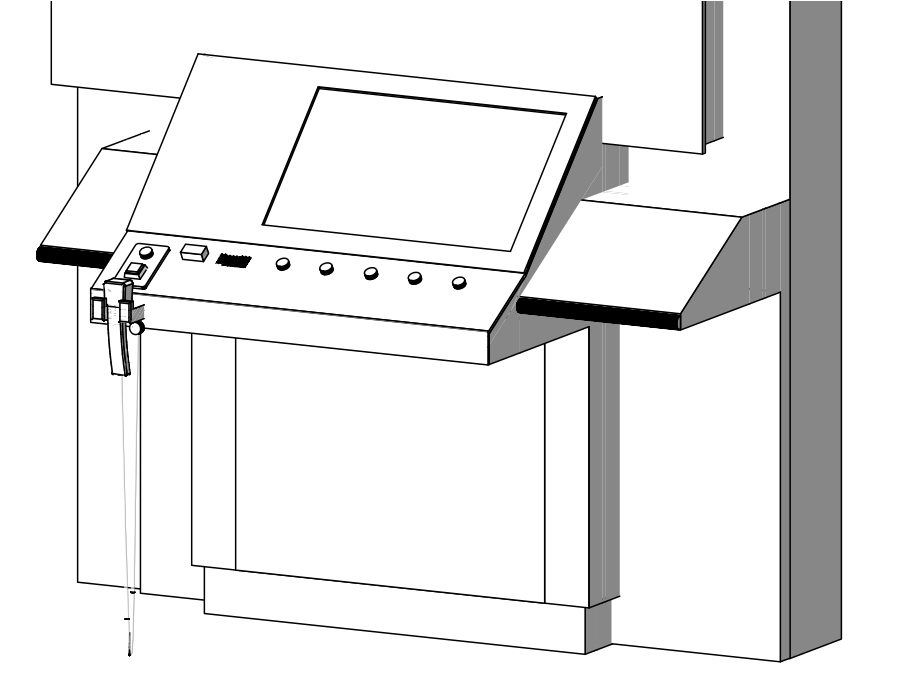
This drawing of the CMME exhibit shows the audio phone handset on the front left edge of the exhibit component. There are two buttons mounted on the slanted surface above the handset that trigger the audio files to play when they are pressed.
The audio phone used for this exhibit has two buttons. The square button audio file contains a physical description of the exhibit so that visitors can orient themselves. The round button contains five audio files that articulate the text, images, and a brief introduction to possible visitor interaction at the exhibit. A file with the full audio phone text can be viewed and downloaded by clicking here. You can also listen to a sample audio file from the audio phone by clicking here (this matches the "Square button" section in the full audio phone text document).
Broadcast text audio
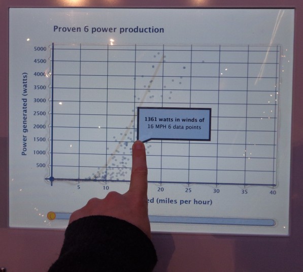
Broadcast text audio provides live feedback in response to a visitor’s action. This feedback includes when a visitor touches the touch screen or pushes a button. This feedback often gives details about their selection and provides additional information about how they might interact with the exhibit. A file with the full broadcast audio text can be viewed and downloaded by clicking here. You can listen to sample audio files from the broadcast audio by clicking on the following links for the button instructions, the introduction to the graph, and a graph title (these match the text in the corresponding sections of the full broadcast audio text document). The dynamic nature of the audio feedback meant some of the phrases and instructions were recorded in separate files and then pieced together in real time through the programming. For example, if a visitor holds their finger in one point on the graph, they will hear seven audio files strung together to describe the date in that area: “Turbine produced - 756 - watts in winds of - 25 - miles per hour - 4 - data points.” We chose not to use any computer generated vocalizations for the text and we recorded all of the audio with the same human voice.
Some exhibits at the Museum of Science have the broadcast audio as an “opt in” feature and visitors have the option to turn the audio on by pressing a button. For this exhibit, we found the introduction to the graph was so important to visitor understanding of the exhibit, we decided to leave the broadcast audio on all of the time. This factor improves understanding for many visitors, but may also limit interactions with the exhibit by visitors who may not want to listen to the audio or who may become overwhelmed by too much auditory stimulation. This concern led us to edit the amount of information we readily broadcast. Additional broadcast audio instructions can be accessed through a “More Audio” button located near the audio phone handset.
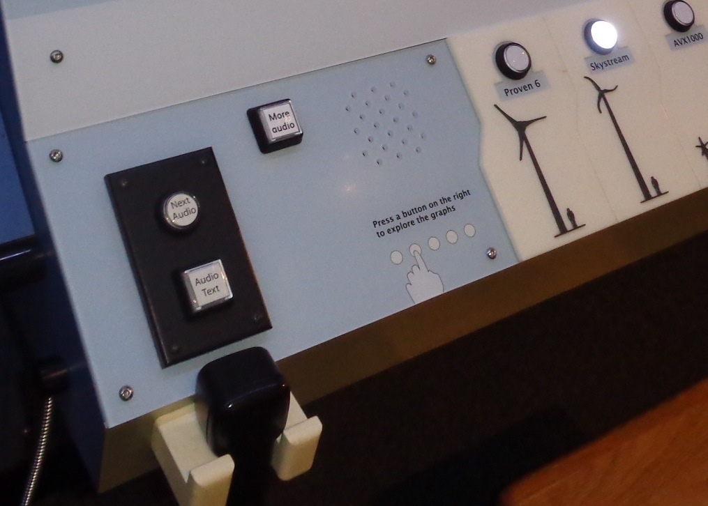
Picture of the front left corner of the CMME exhibit. The audio phone handset and corresponding control buttons are on the far left. The “More Audio” button is a few inches to the right and the cutout holes in the surface, where the speaker is mounted into the tabletop for the broadcast audio, are visible next to the buttons.
Although our feedback was dynamic, we were unable to expand this feedback to encompass audio hints. These would have added dynamic direction about the next available options for visitors when there was any idle time. For example, if a visitor explored touching the screen in the area of the graph, after a brief period of inactivity, the exhibit may then prompt them to, “Try holding your finger in one place on the graph for a more detailed description of data at that point.” This option allows you to divide instructions into more digestible pieces that are given when a visitor is ready for them. This kind of dynamic feedback also involves an additional layer of instruction writing and programming in the software that the scope of our project did not include.
Broadcast sonified audio
In addition to the broadcast text audio, this exhibit also includes sonified audio. These are tones that represent data values on the graphs. Similar to the broadcast audio feedback, the sonified audio is also dynamic and changes based on the current data being shown in the graph. This exhibit shows sonified trend lines in these data and sonifies the data points when a visitor moves their finger over them when touching the screen. Below are two videos showing the sonified data. We used static to represent areas of the graph in which no data is present.
https://www.youtube.com/watch?v=2Rb18O635qE
This video shows when a graph is first selected. As the trend line slider moves across the screen, audio feedback plays out the values, with higher pitches representing higher values in the data. This graph goes from low to high and then plays static for the second half of the graph where no data is present.
https://www.youtube.com/watch?v=UuFJOTZgzqw
This video shows a person moving their finger around within the graph area on the touch screen. Each tone that is played represents one data point and the pitch corresponds to its value. Static is played when the user moves her finger into an area of the graph where no data points are present.
Our decision to include dynamic audio feedback allows a wider range of visitors to interact with the graphs in this exhibit and understand the wind turbine data being presented in the graphs, but we had to be very judicious in our decisions about where use audio in this exhibit. There were a few areas in which we had to remove audio feedback because it was causing confusion.
Originally, the buttons read out an audio title of which option they represented when they were touched, but before they were even pushed. This led to visitors accidentally triggering the audio when they were interacting with another part of the exhibit and lead to confusion about what feedback corresponded with their actions. Additionally, the names of the turbines were often confusing in themselves, so having them repeated was not helpful. We added “wind turbine” with each of the brand names to reinforce the exhibit topic.
At first, we also played the broadcast audio introduction after each graph button was pushed. Some visitors felt this was repetitive, many did not listen, and some felt it was too complex to understand. Additionally, some visitors didn't realize the same audio was being repeated and felt they should listen to it even if they already understood what to do from using the prior graph. This led us to only play the introduction audio and animation the first time a graph is chosen by a visitor, but visitor interaction is locked out during this period to reinforce their understanding of the instructions. For each subsequent graph choice, visitors move straight to interacting with the graph. If a visitor does want the introduction content, a more detailed explanation is available in the “More Audio” button. Once a visitor stops interacting with the exhibit, it times out and moves back to the idle screen. Any additional interaction would once again trigger the introduction to play.
We would like to note that visitors who are deaf can often feel the vibration of the audio and know that there is auditory information that is being shared. If they feel confused by the interactive, they will think they are missing out on critical information. All audio directions in this exhibit are also reinforced with visual text and images, in order to be accessible for visitors who are deaf.

CMME: Graph Paths Not Taken
Written by Emily O’Hara and Stephanie Iacovelli
For the Museum of Science’s portion of the Creating Museum Media for Everyone project, we wanted to create an accessible interactive that featured graphed data. The final exhibit component contains five scatter plot graphs, each with a calculated trend line. In addition to the graph options available in the final exhibit, the development team wanted to find a way for visitors to compare the data between graphs. We explored layering the graphs and comparing data through the use of a bar graph. Although neither of these solutions worked for our exhibit, we wanted to share the paths we tried, as they may be more applicable for others.
Layered graphs
For this exhibit, we were revising an existing element in the Museum’s Catching the Wind exhibition. The original graph interactive enabled visitors to view the power production graphs of the same five turbines we used in the final version, but it also allowed visitors to compare the turbines by layering two, three, four, or five of the data sets on one graph.

Picture of the original exhibit computer screen, showing how data for two of the turbines could be layered on the same graph. Scatter plot points for one of the turbines are shown in red and those for the other are shown in green.
When we began adding sonified audio tones to the data, in order to make the graphs accessible to visitors with low or no vision, we wanted to maintain the option of comparing graphs. We first attempted to simply layer two tones on top of one another and have them play simultaneously. This was not successful and users did not always realize there were even two different sounds present. Next, we tested playing one graph’s sonified trend line followed by the second, then playing both of them together. When we tested this with visitors who are blind, this method helped with comprehension and comparison, but ultimately we did not find the benefits of playing the layered audio outweighed the risk of confusion.
Bar graph
We also developed a bar graph for display in this exhibit so that visitors could more easily compare the power production of each wind turbine on the same graph.
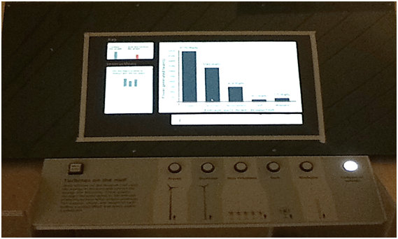
Picture of the bar graph prototype. For this version of the exhibit, visitors could still view each of the five wind turbine scatter plot graphs and then the bar graph was added as a sixth option. This version also had an area of the touch screen which contained dynamic instructions which changed to correspond with the type of graph on display.
While this type of graph allowed visitors to compare between wind turbines, we found it also required another layer of graph orientation. In addition to the detailed introduction visitors needed for the scatter plot graph, they needed another set of instructions for the bar graph. Switching between scatter plot and bar graphs also created additional confusion for users who are blind. We were using tactile grid lines to help orient visitors on the scatter plot graph and then, on the bar graph, the vertical grid lines no longer had meaning, but were still present on the graph. Overall, we decided the value of the bar graph was not worth the confusion it caused in our particular exhibit.
In our final exhibit, each graph only shows the data from a single wind turbine’s power production. To help visitors compare the graphs with one another, when a graph is first selected, the graph title is read and then the sonified audio trend line for that data is played. This enables a visitor to press each button of the graphs they want to compare and view or listen to them in quick succession. The axes values are also maintained between graphs to allow for this comparison.
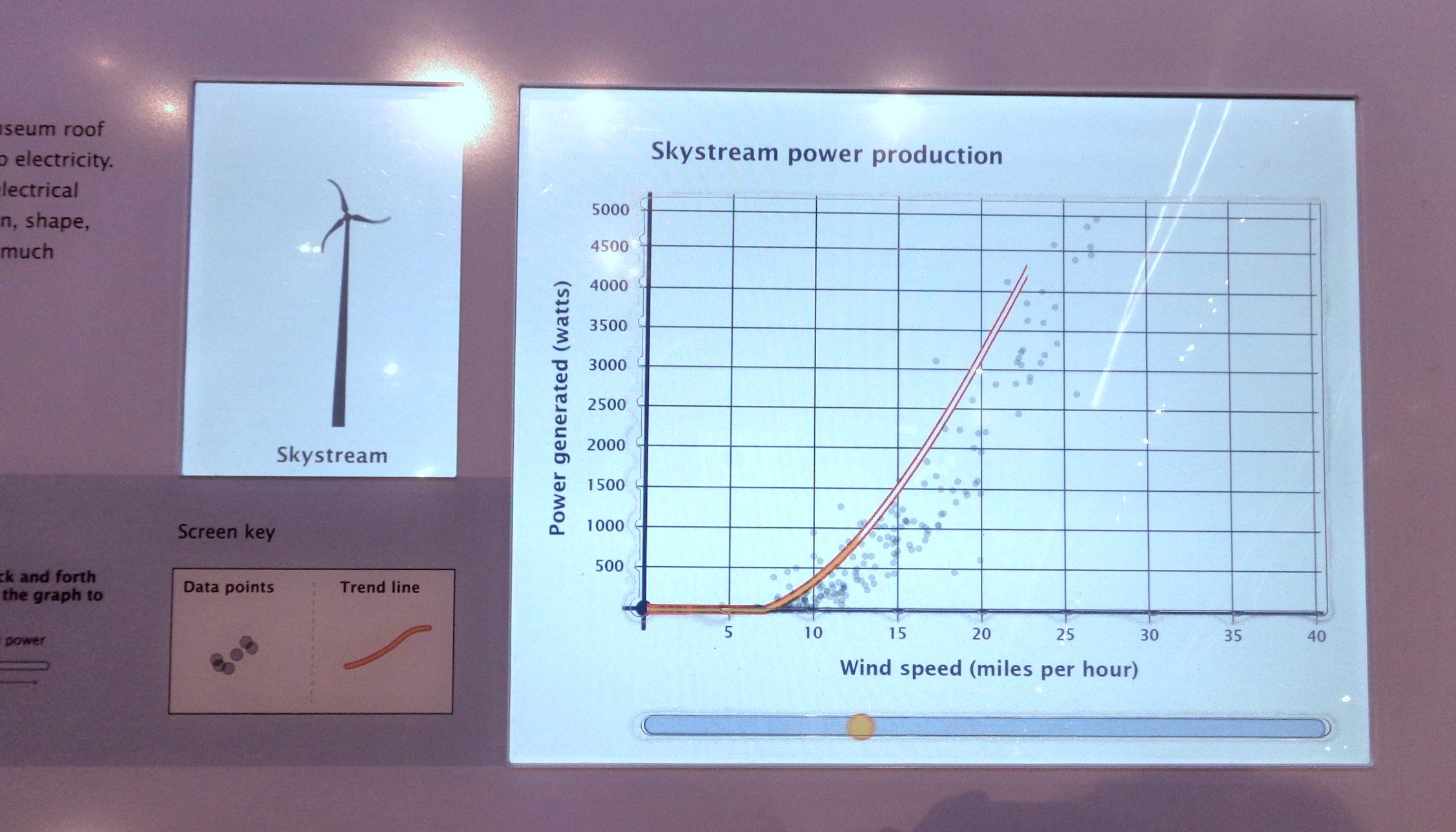
Picture of the final exhibit screen displaying the Skystream wind turbine’s power production graph. Scatter plot dots represent each data point that was collected and the bright orange line drawn through the middle of the data points represents the trend for these data. A horizontal bar runs below the length of the graph area and contains a circle which can be moved back and forth to play back the audio sonification of the trend line.
How would you design an accessible exhibit to compare data sets? What other types of graphs would be useful for this comparison?
CMME: Design Toolkit
Contributions from Malorie Landgreen, Emily O’Hara, Robert Rayle, Michael Horvath, and Beth Malandain This post includes the design specifications for the final exhibit we created as the Museum of Science’s portion of the Creating Museum Media for Everyone (CMME) project. In addition to the physical specifications you will read about below, we also wrote a blog post where you can download the source code for this computer-based interactive. The design toolkit for this exhibit includes:
- Annotated technical drawings of the as-built casework
- Annotated digital and print graphic files
- High-contrast tactile model options
- Buttons and audio phone parts list
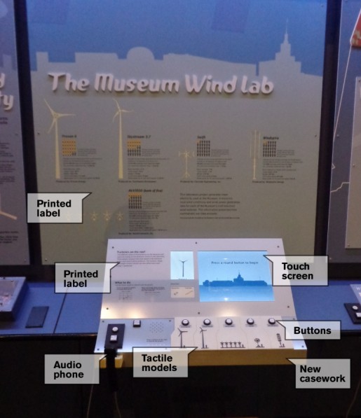 Picture of the final CMME exhibit with labels showing the locations of the printed labels, buttons, audio phone, tactile models, new casework, and touch screen.
Technical drawings:
The technical drawings for this exhibit show the as-built casework. You can download an annotated .pdf file of the CAD drawings for the exhibit by clicking here.
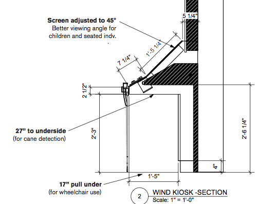 This exhibit was a refurbishment of an existing component, so you will see how we built the new casework over the previous design. These adjustments were made so that we could fit in the touchscreen and the control button interface, but we also made some design decisions for the new casework so that the final exhibit was more accessible. Some of these changes include:
- Relocating the audio phone to the front edge of the new casework
- Adding a speaker to play broadcast audio
- Adjusting the touchscreen to be mounted at a 45-degree angle for better viewing for children and visitors who were seated
- Lowering the underside of the kiosk to 27” to enable cane detection for visitors who are blind/have low vision
- Ensuring the new pull-under space was 17” deep to facilitate ease of use by wheelchair users
Digital and print graphics:
The annotated PDF of the digital and print graphics for this exhibit show the final designs used in the exhibit. The primary elements that were taken into consideration include:
- Font size for body copy of printed and digital labels should be no smaller than 22pt
- Contrast between the text and background of printed and digital labels for body copy is ideally at 70%
- A tactile touchscreen overlay that was clear, durable, and did not affect use of the touchscreen
 Picture of the touchscreen with the overlay. The edge of the cutout in the top layer of polycarbonate is visible along the graph axes.
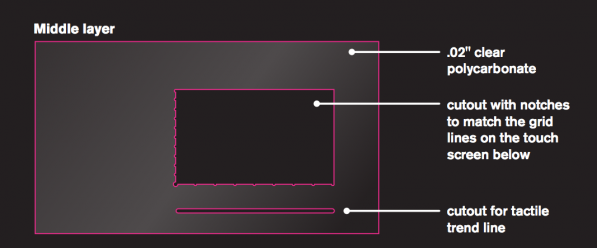 For the touchscreen overlay we used two adhered layers of the 0.020'' from McMaster-Carr #85585K15. The top layer is cut so that the axes are tactile, with notches at each gridline, and the trend line slider below. The bottom layer protects the touchscreen.
High-contrast tactile models:
In order for the tactile scale models of the wind turbines to be useful for all visitors, we wanted them to be raised for use as touchable models, but also high-contrast, so that they were visible against the background. We had the tactile images made as 3D prints, but they can also be made as plastic casts.
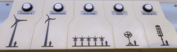 Picture of the five high-contrast, tactile wind turbine images, each with a representation of a six-foot person for scale. These tactile pieces are 3D prints.
To create the high-contrast, 3D-printed images, our exhibit designer used Adobe Illustrator software to draw the turbines to-scale with an image of a six-foot person next to each. The turbines were drawn within a larger background piece, so that all five would line up next to each other on the final exhibit and for durability. If each turbine was 3D-printed alone, the fineness of the turbines would not have allowed for a strong adhesion to a backing piece.
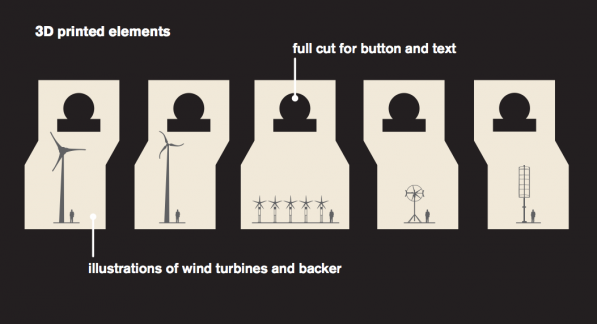 Image of the illustration that was used to create the 3D prints. This drawing was then converted into Vectorworks. The file was sent to PROTO3000 and they made the two-color 3D prints with the turbines in dark gray and the background in cream.
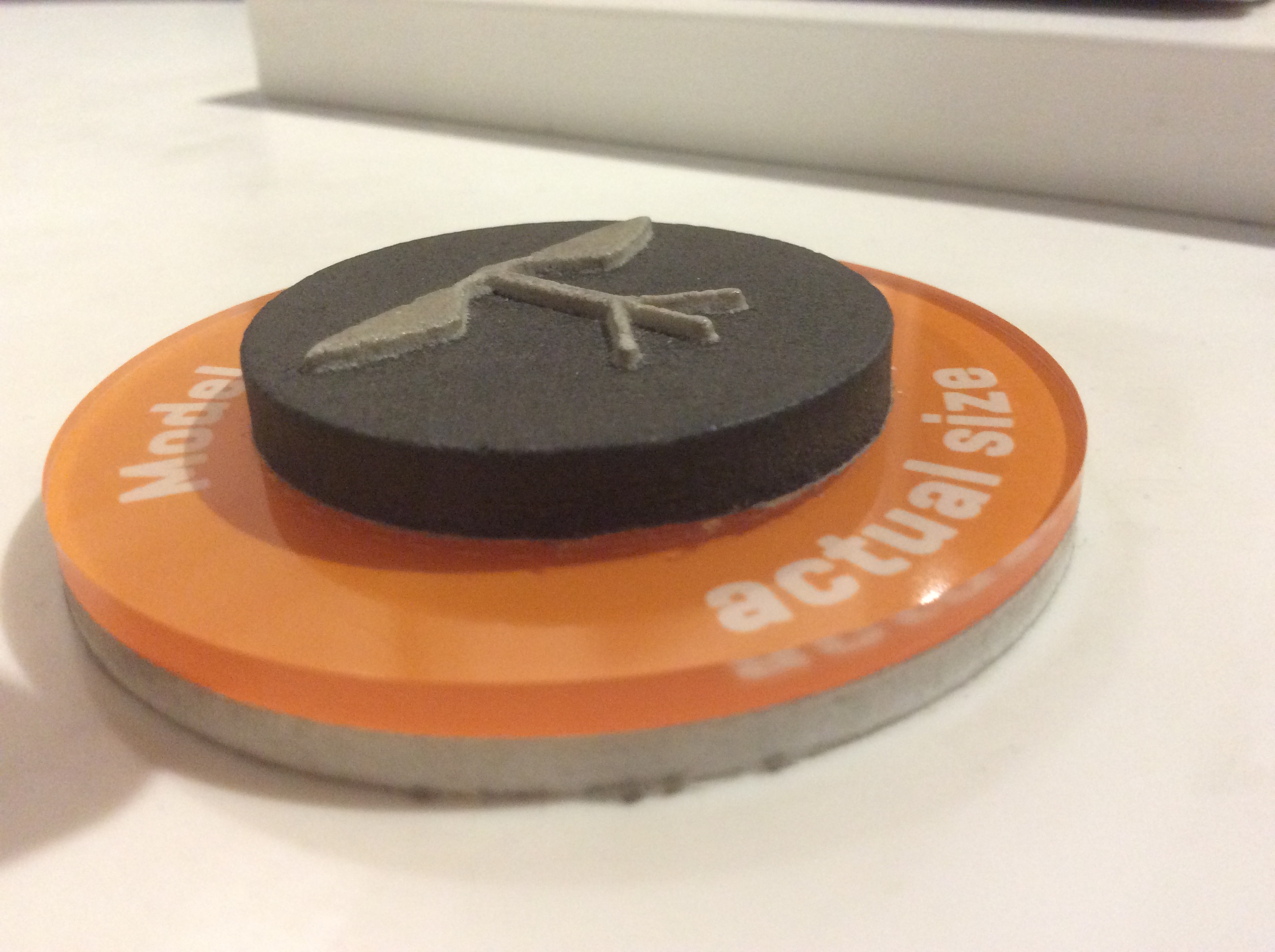
 Picture showing a close-up of the 3D printed turbines. The lines from the 3D printing are visible and they create a subtle texture that can be felt in the final product.
The five 3D-Prints (ABS-M30)cost$925.00, but they were the only way we were able to produce the fine lines of the wind turbine models. We were worried about the durability, but they have been on exhibit for almost six months and they are holding up well. None of the fine-lined pieces have broken.
If the durable, two-color 3D printing is out of your price range, creating a two-color plastic cast is another option. We used this technique for another exhibit and it has also held up well while on exhibit. For this technique, you could make your own object to create the mold, or have a single-color 3D-print of the object in a less durable material made (which is less expensive), and then use that print to create a mold to create your two-color cast. This also enables you to create extra copies of the tactile pieces as replacements, if they are ever needed.
 Side-view picture of a tactile model on display at the Museum. This tactile model was cast in two colors of plastic, grey and black, to create a high-contrast image that was touchable. You can see the shallow depth of the tactile piece against the background. We found that too much depth separating the image from the background made it harder for visitors to interpret the shape through touch alone.
Buttons and audio phone:
The buttons and audio phone technology we used for this exhibit match those we use in the rest of the Museum. These are products we have found to be durable and easy to maintain. We also try to keep them consistent so that visitors recognize how to interact with them throughout their Museum visit. We use illuminated buttons with 3-chip white LED lamps from Suzo –Happ. Our audio phones are Gorilla phones from Stop & Listen. Each of the Gorilla phones is hooked up to an audio player. We use the CFSound IV player from Akerman Computer Sciences (ACS).
CMME: Using Personas in Exhibit Development
Personas, or hypothetical archetypes of actual users, were created as part of the Creating Museum Media for Everyone (CMME) project. Each persona represents a potential visitor and their characteristics were developed using real user data. These personas were meant to help guide exhibit development teams to think about the exhibit experience for a wide range of users. You can read more about the development of the personas by clicking here. You can also view and download the most recent version of the personas by clicking here.
For the final CMME exhibit at the Museum of Science, we used the personas to help define the potential visitor experiences and identify where gaps in each user’s potential experience may exist.
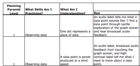
This is a snapshot from the full persona goal planning document we developed. You can download the full version of our goal planning spreadsheet by clicking here.
When planning to use the personas, we first defined the skills a visitor would be practicing and what they would understand from each of those interactions, within three learning levels. These levels were based on the Planning Pyramid Degrees of Learning, as defined by Schumm, Vaughn, and Leavell (1994). The reinterpreted levels we used for the exhibit are:
- Level 1. What all visitors should learn
- Level 2. What most but not all visitors will learn
- Level 3. What some visitors will learn
Visitors need to understand and practice the skills at level one, in order to build on their learning in level two and level three interactions. An example of a level one goal is that visitors would use the skill of observing data to understand that one dot on the scatterplot graph represents a piece of data. This basic understanding is necessary for a visitor to understand all other elements in this graph-based exhibit.
We then extrapolated each of these skill/understanding pairs and defined how each of the persona examples would interact with the exhibit at that level. For example, when using the Cynthia persona we would first refer to her persona description for characteristics we needed to consider when imagining her interaction with the exhibit:
- Cynthia became blind as an adult, she desires specific (but not simplified) instructions, and relies on audio information to give her directions.
We would then write out, based on the exhibit design, how Cynthia might accomplish each goal.
- Level 2 goal: Visitors will practice describing data and understand there is a pattern in the data.
- Cynthia’s interaction: I detect a pattern in the data auditorily (broadcast audio). Audio (broadcast audio, sonification of the trend line, and audio text label) prompts help me observe patterns I might not have noticed.
We extrapolated the 13 interaction goals for each of the eight personas. This practice also revealed where there were holes in supporting visitor interactions, for example:
- Level 2 goal: Visitors will interact with the data by exploring details within the data.
- Some of Alec’s characteristics: Alec has Autism Spectrum Disorder, he is comfortable with computers, prefers quiet environments, and, when using interactives, he likes to be able to manage the amount of sensory stimulation he receives.
- Alec’s interaction for the level 2 goal: The current version has audio feedback always linked to tactile exploration. He would not have control over managing the amount of sensory stimulation he received while he was actively interacting with the graph. This would be a limiting factor for Alec's interest and willingness to explore the details within the data.
Our team decided that not all goals needed to be met by all visitor personas. For example, we acknowledged that Molly, who has an intellectual disability and doesn’t particularly like science, might not interact with the exhibit for the level 3 goal of using data to compare/draw hypotheses and understanding that you can answer your questions by observing patterns in the data.
Going through the process of defining the degrees of learning goals for the exhibit enabled us to understand the ways in which we hoped a visitor might understand the exhibit. Writing out the specific experiences we imagined for each of the persona characters then enabled us to have a concrete vision of which components supported these visitor interactions, which components detracted from a visitor’s experience, and where there may be holes in the visitor experience.
How might you use the personas in exhibit development? Share your thoughts in the comments below.
Schumm, J.S., Vaughn, S., & Leavell, A.G. (May 1994). Planning pyramid: A framework for planning for diverse student needs during content area instruction. The reading teacher, 47 (8), 608-615.
CMME Workshop Discussion: Applying Universal Design to Museum Experiences
The Creating Museum Media for Everyone (CMME) workshop brought experts from many different fields together to consider how to create accessible digital interactives for museums. Much of the week-long CMME workshop was spent creating prototypes for digital interactives that focused on data manipulation. In addition, workshop participants had one discussion about other typical museum experiences that are facilitated through digital interactives and how they might be made more inclusive to all visitors.
The three types of digital interactive-based museum offerings that CMME workshop participants discussed were:
- exploring artifact-based collections,
- learning about current science and technology through an updating newsfeed, and
- taking part in design-based activities.
Outlined below is an overview of the questions and ideas that arose in the discussions around making these experiences accessible to all visitors.
Exploring artifact-based collections
During the CMME workshop, participants discussed how computer interactives can be used to help offer interpretation of artifacts that are presented in a museum’s galleries. As can be seen in the photo below, the Museum of Science has incorporated digital interpretation in some of their exhibitions such as the Colby Room to allow visitors to explore artifacts that would otherwise be inaccessible.
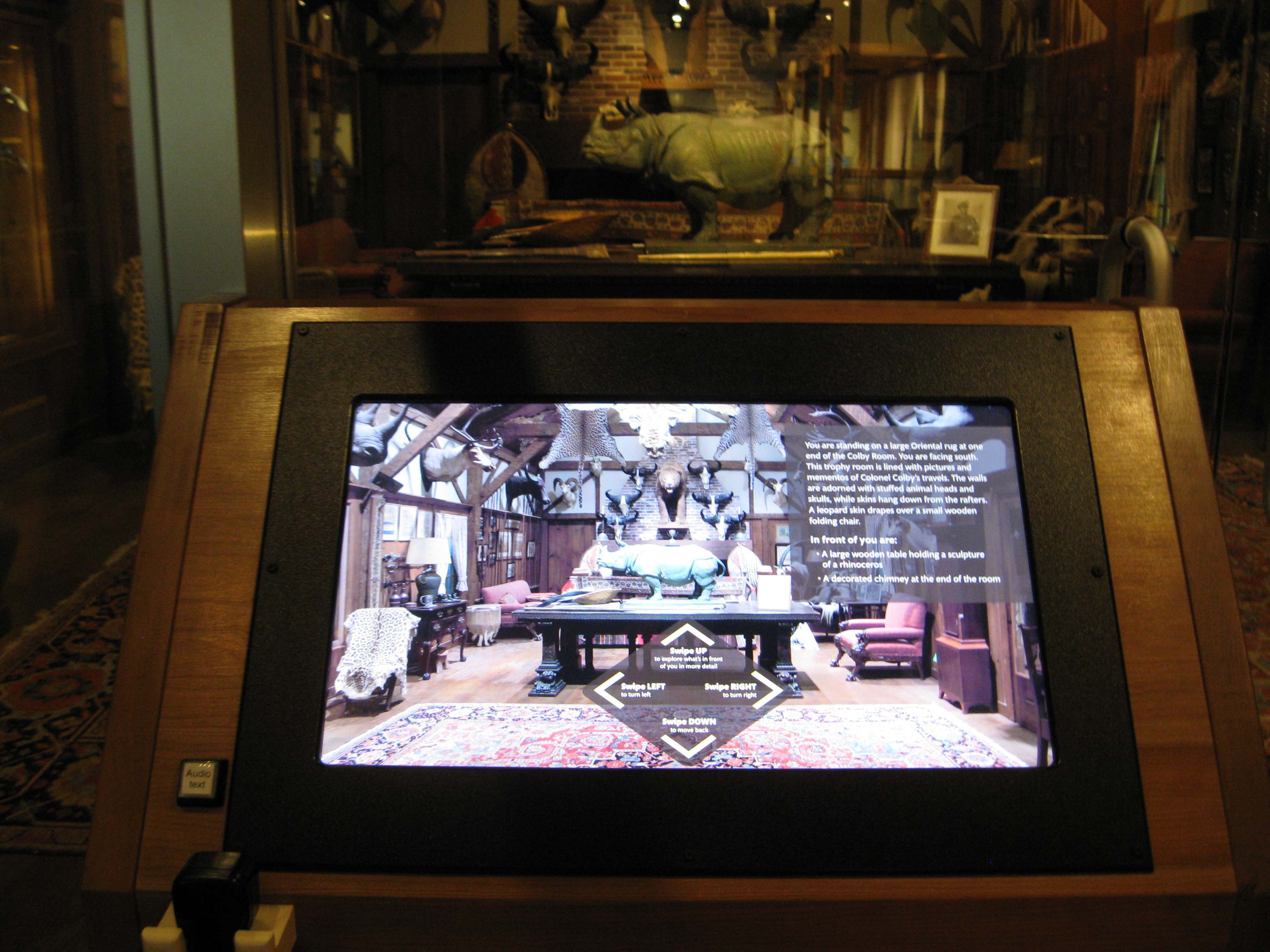
Photo of a digital interactive that allows visitors to explore artifacts in the Colby Room at the Museum of Science, Boston
However, at the CMME workshop participants discussed how making artifacts accessible requires more than just offering the interpretation in multiple formats. Some of the main questions and ideas that came up when thinking about how computer interactives could help visitors explore artifact-based collections are listed below.
What do you need to keep in mind about the design of the learning experience?
- Consider what will be most meaningful for your visitors when deciding what to display. There may be pros and cons to displaying detailed information about each artifact.
- Include tactile or haptic versions of the artifacts to increase opportunities for engagement. Teaching collections may be one way to allow visitors to handle artifacts.
- Provide additional interpretive materials such as labels with pertinent information or descriptive audio messages so that more visitors can better understand the collections or messages you are trying to convey.
- Think about how computer-based interactives can provide further opportunities for learning and engagement. Interactives could link to a digital database or allow visitors to add their own knowledge about an artifact to the display.
- Consider ways to simplify information and provide organization and structure so that visitors with a range of abilities can access the information. For example, offer a general overview of the digital interactive’s content before options for drilling deeper.
- Create compelling stories that allow more people to engage with the exhibit. Use provocative pairing of objects to help visitors connect with the display and the overall exhibit message.
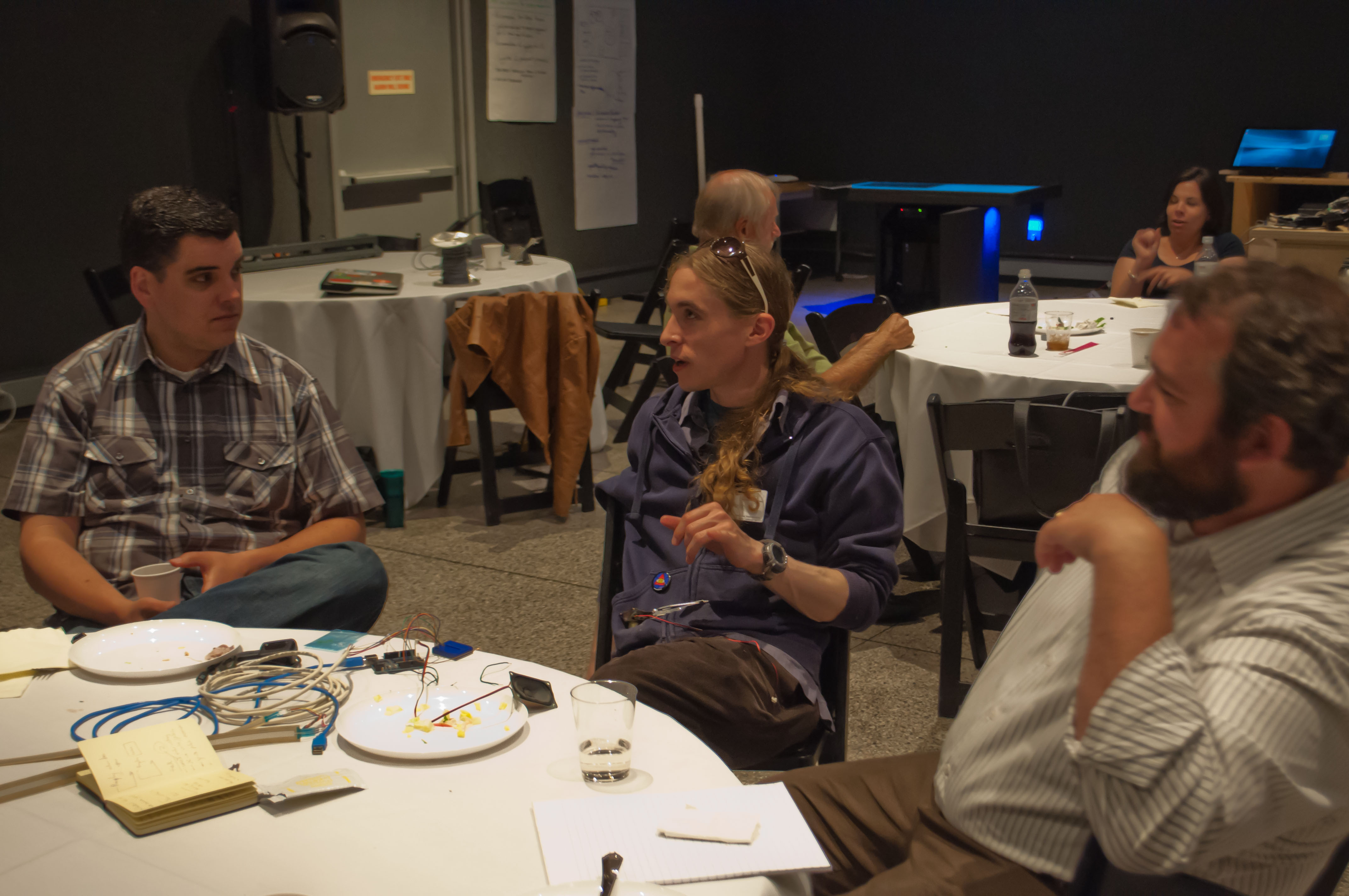
Photo of professionals brainstorming at the CMME workshop
Learning about current science and technology through an updating news feed
Another type of digital media experience that some museums offer is an updating “news feed” of information. These communication channels are providing new ways to interact with visitors and non-visitors alike. For example, science centers may be posting Twitter-type updates or links about new scientific discoveries to their website. At the CMME workshop, participants discussed some of the following questions when considering the creation and accessibility of these increasingly popular digital museum experiences.
What is the purpose of your news feed?
- Articulate what your museum is trying to accomplish in order to help potential followers have a better understanding of the type of information that will be included.
- Are you trying to digitally engage people after their on-site visits are over?
- Do you want to show that scientific research is occurring in real time?
- Do you feel that access to current information will help inform the public’s decision-making?
What types of information are people expecting to receive from the museum on an updating basis?
- People don’t necessarily look to museums as sources for breaking news.
- Highlighting connections between news stories and the institution’s mission, exhibits, or collections may help people better understand the museum’s relevance.
Who is curating the posted information and what is the timeframe of breaking news?
- Where does this digital information come from? Quality matters.
- Who posts new information? Museums are in a unique position to add additional context or background information to a story by drawing from their own institutional research or exhibits.
- When will new posts be uploaded? Reliability is important.
Is the news feed universally designed and accessible?
- Museums must create accessible ways for people to navigate through the available information and perceive what is on the news feed.
- For visitors who are blind or have low vision, is the news feed screen-reader compatible? Are there audible options for learning about updates?
- For some visitors on the autism spectrum the news feed should not be too visually overwhelming.
Will people be able to contribute to the conversation?
- Allowing people to add their own opinions and share information might further the conversation and deliver a more engaging experience for visitors.
- It is necessary to provide feedback opportunities that are accessible to a range of users.
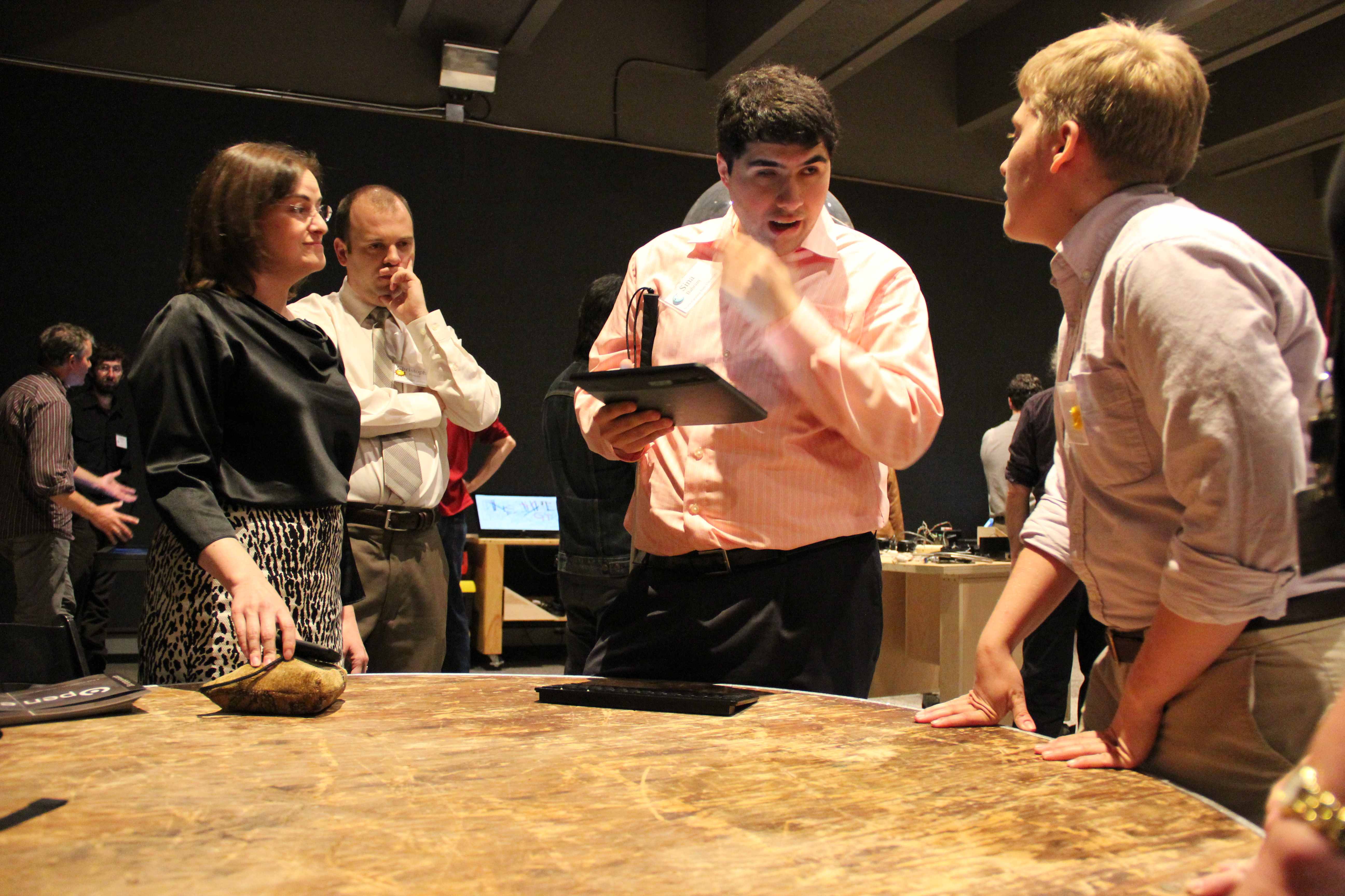
Photo of CMME workshop participants in discussion
Taking part in design-based activities that are inclusive to everyone
Iterative design-based experiences, such as maker spaces or engineering design challenge activities, have become widespread in museums, especially in science centers. These experiences encourage creative thinking and hands-on participation by having visitors make different creations or solve a problem by creating a product. At the CMME workshop, participants talked about how incorporating digital technology into this process might help make these activities accessible to all visitors, including those with disabilities. Below are some ideas and questions that arose during this discussion.
Are the materials and the space accessible?
- At many design spaces, visitors have to move to different stations to gather materials. Limiting the need to move from one table to the next and having all necessary materials in one spot might help reduce visitor confusion and make the experience better for those who are blind or who use a wheelchair.
How can you help all visitors work through different steps of the process?
- At some institutions, facilitators help visitors through the design process. However, at museums where there is no facilitation, adding radio frequency identification (RFiD) tags that trigger descriptions of the different steps and materials could enable broader participation and scaffold the process.
- RFiD tags could connect with a digital screen and provide information and suggestions about the different materials through audio and captioning.
- Positive feedback from facilitating staff and RFiD-tagged objects could help encourage further visitor engagement.
- The RFiD tags could also be programmed to trigger reminders for visitors to clean up their designs or leave materials at the station.
How can visitors test their designs in an accessible manner?
- Testing designs is an important part of the design process at these types of activities.
- Museums can increase accessibility in the testing process by offering many different levels of success. For instance, the task may have more than one goal or way to define a winning design. Visitors could choose which goal they want to accomplish. Taking into account the number of times someone tests their design could also help determine whether or not someone accomplished the task.
We hope that information from this brainstorming session at the CMME workshop will be helpful to you when thinking about accessibility in your projects. If you have other thoughts about how to make these types of museum experiences accessible to all or examples of how you’ve done so in your own work, feel free to share them in the comments below.