Blog
CMME: Toolkit Source Code for Interactive
Written by Ben Jones
This computer-based interactive is the result of our Creating Museum Media for Everyone (CMME) work at the Museum of Science. In this post, we are including the source code so that individuals or institutions can repurpose the code for their own projects. A full description of this exhibit can be found in the Final Exhibit Component blog post.
In this interactive, we used a wind turbine dataset from our “Catching the Wind” exhibition. The dataset was used to create five scatter plot graphs, each with a trend line, which can be explored and sonified to the visitor through a touchscreen interface. There are physical buttons in front of the touchscreen that allow switching between each of the graphs.
In our exhibit we graphed five datasets. In the exhibit, each of the graphs is triggered through a button press, but when working with the source code, each of the graphs aligns with keystrokes 1-5, so that you can view each dataset individually. Pressing 7 will give you additional instructions about how to use the interactive, which is normally triggered by another button on the physical exhibit interface. The interactive has a time-out feature and the next person interacting with the interactive is assumed to be a new visitor. The interactive locks each new visitor into a tutorial, which explains how to use the interface. Control is given back to the visitor after the tutorial is finished.
The included source code is being released with precompiled executables for Windows and Mac OS. The executable and the datasets load dynamically in a configuration file. Both of these can be adjusted to fit your own data and look-and-feel.
The files can be downloaded by clicking here.
The Config XML file can be used to customize the following aspects of the interactive:
- Datasets
- Graph Titles
- Axis labels
- Time-out length
- All images
- All sound files
- Size and color of data points
- Size and color of trend line
- Keystroke graph selection
A few things to note that are not customizable in this interactive through XML are:
- Read aloud values less than 0 or greater than 9999
- Decimal numbers (1.5, 2.7, 3.14, etc)
- Number of tick marks on graph
- Playback speed of sonification
If you want more functionality than the current program, the source code is available to be customized. This interactive was written in C# and is built to run on the free version of Unity.
We'd love to hear the cool things you're doing with the source code for this interactive! Please share in the comments section below.

CMME: Haptic Paths Not Taken
Post written by: Marta Beyer, Peter Moriarty, Emily O’Hara, Robert Rayle
Going into the Creating Museum Media for Everyone (CMME) project, our team had several key criteria in mind when experimenting with the creation of a haptic exhibit:
- the exhibit needed to allow visitors to explore, interpret, and compare graphical data sets;
- the exhibit need to allow visitors to be able to identify trends within the data and to explore individual data points; and
- the exhibit needed to be durable and affordable.
Below is a description of five different haptic approaches we considered for this project. These approaches primarily focus on haptics as an output method for feedback; although, we acknowledge some technologies can also be used for haptic inputs. This post highlights some of the challenges we encountered and some of the decisions we made along the way in regards to including haptics in the final exhibit.
Haptic approach—Vibration levels
Although members of the CMME team have been thinking about haptic possibilities for many years, the specific efforts related to this grant began during a multi-day workshop held in the spring of 2012. This workshop brought experts from diverse fields together to consider how to develop accessible digital museum interactives that convey scientific data. One of the multi-institutional teams focused on how dynamic haptic options could tactically represent data displayed on a graph. During their brainstorming, the team explored various possible devices such as air tables, ball bearings controlled by magnets, vibrating tables, and contrasting tactile elements. The team also thought about how visitors may not have an established skill set to interpret haptic feedback and how that might play into the exhibit design. After just a few days thinking about these questions, the team had a working prototype that conveyed information through a vibrating puck device that used three different tactile speeds. This directional vibration feedback was created using an off-center rotating pager motor mounted in the puck. Click here to read more about this work and watch a video of the prototype.
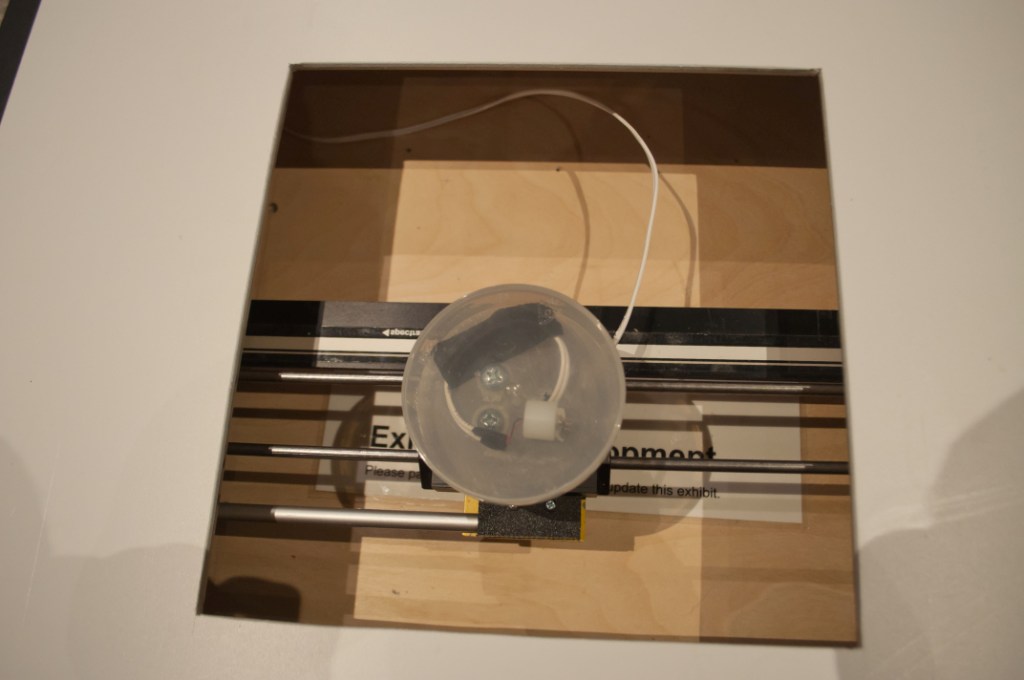
Photo of the haptic prototype created during the CMME Workshop
Challenges
- Visitors often do not have detailed touch memory that allows them to distinguish between multiple vibration frequencies and to remember what they signify.
- Visitors can easily get vibration fatigue.
- Having a puck on the component’s surface made it difficult to see the visual aspects of the graph.
- Traditionally, analogue doorbells and pager motors can be used in this application, but there are concerns about long-term sustainability because they are being phased out of production for commercial applications.
Decisions made
- After considering these constraints, especially related to visitors’ limited touch memory, the team felt that the puck’s level of granularity, or range of three vibrations, was not sufficient for conveying the detailed content information. For an exhibit with deeper learning goals about understanding graphical data and a fine resolution of data points, we would need more tactile means than just three varying levels of frequencies to convey this content. After the workshop, the team took what they had learned and tried the following approaches for creating a haptic component to convey data alongside a visual and sonified graph.
Haptic approach—Moving arm
One of the next strategies that the CMME team considered was a moving arm that could provide haptic feedback to visitors. Some commercial technologies use a device that acts as both an input and output haptic controller to recreate the physical feedback of digital imagery. Most of these applications are used in video games, so that users can feel the vibration of their digital car driving down the road or the kick back of firing a gun while simultaneously using the same device to control their video game player. For example, the Novint Falcon is a gaming device that offers these features in an off-the-shelf product.
Challenges
- This technology is fairly expensive and cost prohibitive for other institutions who might want to replicate this work.
- The durability of this technology has not been tested in museums.
- This technology is focused on inputs and outputs for game feedback and may not be as applicable unless it is used in a gamified museum experience.
Decisions made
- We decided not to further investigate this technology’s potential because the current options are financially out of reach for many in the museum field.
Haptic approach—Rumble
Because a traditional haptic feedback mechanism involves an off-kilter, pager-type motor to create linear vibrations, we considered using a variation of this method to convey more detailed graphical information. Linear resonant actuators, also known as voice coils, can use the same data as sonified outputs and apply them to a vibration mechanism. This rumble effect would give visitors the opportunity to feel different amounts of vibrations representing data densities or data values. We hoped this method would allow for finer granularity than the original vibration mechanism tested during the CMME workshop.
Challenges
- This method requires specialized technical design and staff knowledge.
Decisions made
- We were pursuing multiple haptic methods concurrently and when we hit a staffing roadblock with the rumble technology, we decided to pursue other possibilities for using touch to convey data in our exhibit.
Haptic approach—Nuts and bolts
We also tried some exhibit prototypes that incorporated nuts at various heights on an array of bolts. The hope was that the final component could dynamically display data by turning the bolts, thus, making the nuts move to represent different values. During prototyping, each nut represented one of nine data points in a graph. The higher the value of the data point, the higher the nut was positioned vertically off the white box. To tactically understand what the graph was conveying, visitors felt the different positions of the nuts.
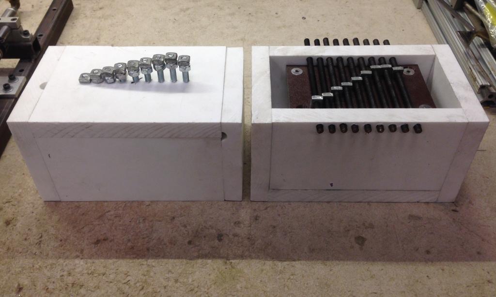
Photo of nut and bolt prototypes. Prototype on the left shows square nuts positioned on vertical threaded rods. Prototype on right shows square nuts positioned on horizontal threaded rods.
Challenges
- Even when tested in a static manner, with nothing moving, visitors had difficulty understanding the exhibit’s content.
- Specifically, visitors had trouble tactilely distinguishing between the nut and the bolt and how that was meant to represent data.
Decisions made
- We stopped exploring this haptic option after visitor confusion was apparent during testing and moved on to another haptic possibility for conveying content—moving air.
Haptic approach—Array of forced air
For this prototype, we used the sensation of different air pressures to convey data values. By hooking an air compressor to an array of valves that controlled how much air exited a series of holes, we were able to use higher pressure to represent higher values on the corresponding graph.
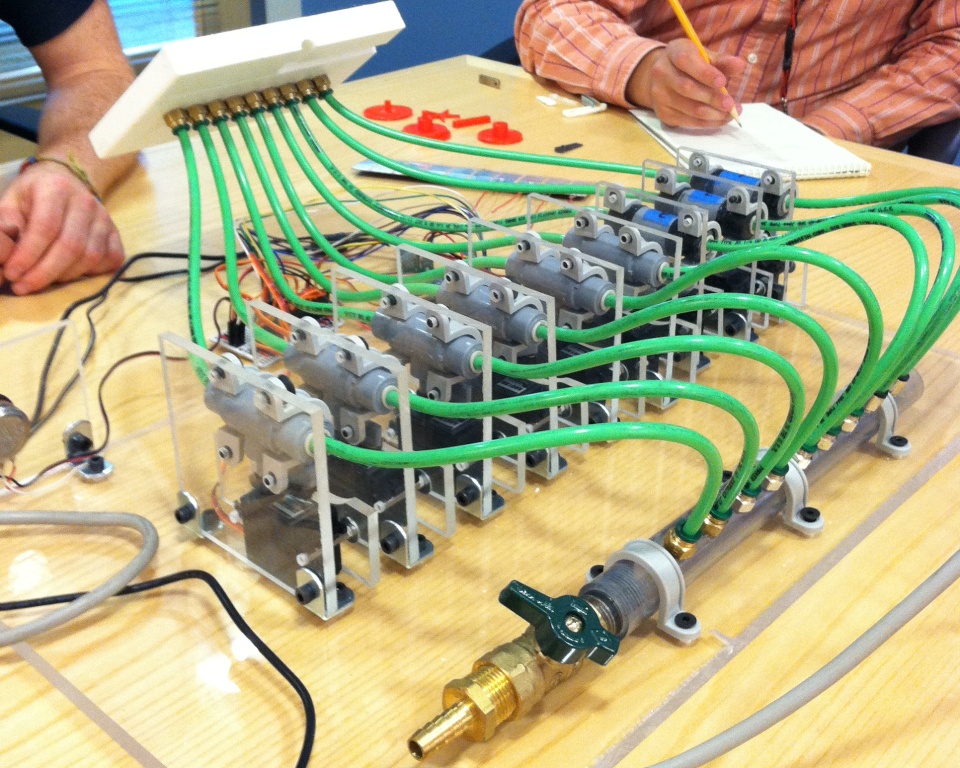
Photo of the central interface of the forced air haptic prototype
For this testing, both the sonification and haptic approach were used in combination. In this video, the visitor is feeling differences in air pressure and also hearing different audible notes that correspond with the value of the trend line, depending on where their hand is located along the x-axis of the graph.
Challenges
- Combining this haptic method with sonification of the graph proved confusing and over-stimulating for visitors. In most cases, they played the air holes like a musical instrument and did not even notice that there was an accompanying graph.
- The long-term durability of the valves used to control the air is uncertain.
- Since this approach used compressed air and each air hole generated a certain amount of noise as air flowed out of it, this design approach was rather loud. However, this could be replaced with an off-site air compressor when installed in a final exhibit.
Decisions made
- Because sonification was the most promising route for creating a universally designed exhibit and because we had not found any affordable haptic options that did not over-stimulate visitors while also conveying the needed level of content, we stopped pursuing haptic possibilities. To learn more about what the final exhibit looks like click here.
Summary of haptic work
For the CMME project we explored how haptic technology might be incorporated into museum exhibits. Challenges kept our team from fully developing a haptics interactive; however, we have not given up on the immense possibilities that exist for haptics and museum exhibits. Indeed, it is likely that some of the issues we encountered with specific haptic technology, such as price and durability will be less of an issue in the future. We can’t wait to see what these exhibits look like and what expanded learning opportunities and accessibility they bring. If any of you are working on haptic projects at the moment or have other resources we may have missed, please share in the comments below!
CMME: Haptic Possibilities in Exhibits
Post written by: Marta Beyer, Peter Moriarty, Emily O’Hara, and Robert Rayle
Through the Creating Museum Media for Everyone (CMME) grant, the Museum of Science and several other institutions set out to explore various possibilities for developing accessible digital museum interactives. One particular area CMME allowed us to explore was the potential of haptics technology within museum settings. Haptics, the ability to get information from touch, present a promising and unique way to convey information. By sharing many of the lessons we learned about haptics in this series of blog posts, we hope the field can continue to discover possibilities connected with this technology. The first post below provides a quick overview of why we were interested in exploring haptics and some of the initial research we did for the CMME project. In a second post we describe some of the haptic methods we tried.
Project background and inspiration for haptics
With the CMME grant, we set out to consider how haptic technology could be used in a museum exhibit to provide information to audiences of all abilities. Specifically, we were trying to figure out how haptics could be incorporated into an accessible digital exhibit focusing on data exploration. As we started this project, we were aware that some museums currently incorporate basic haptic experiences to provide dynamic tactile feedback. For example, in the Museum of Science’s Take a Closer Look exhibition on senses there is a very basic tactile experience that includes a small vibrating post. By touching this post, visitors can gain a sense of how sensitive their skin is to different frequencies of vibration.

Photo of a visitor touching the vibrating post in a haptic interactive experience in the Museum of Science’s Take a Closer Look exhibition
Another haptic experience at the Museum of Science is in the Making Models exhibition, which highlights how people employ many different types of models to understand the world. One exhibit component, in particular, reveals several different ways humans model a heart, including a computer animation showing blood flow, a plastic model replicating the heart’s shape, a heart-shaped candy box, and words in different languages that convey the abstract concept of a heart. One model includes an audio representation of a heartbeat. Here visitors can also place their hand on the thin plastic sheeting which covers a speaker and feel the heartbeat through direct haptic feedback.
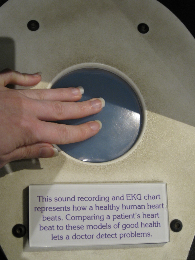
Photo of a visitor touching the haptic part of this exhibit component to feel the sonified heartbeat in the Museum of Science’s Making Models exhibition
Together, these exhibits encouraged us to think about even broader possibilities of haptics in museums and the potential to convey more complex ideas using touch.
Haptic resources
In addition to referring to these haptic exhibits, we also turned to other resources for haptic inspiration. The following list includes some of the most helpful resources we referenced.
- On this site industrial designer Camille Moussette shares his Ph.D. thesis on different forms of vibrational feedback. It explores a variety of haptic techniques such as shaking a whole unit, rotational vibrations, whacking vibrations, and some combination of these. For his dissertation, Moussette built different prototypes to document the processes and results. This reference provides a wide spectrum of ideas and inspirations and is a good starting point when making design goals and exhibit goals.
- This site is an in-depth exploration of specific haptic motors, in particular, ERM (eccentric rotating mass or pager motor style) and LRA (linear resonant actuators or voice coil style). It highlights the design choices one needs to think about when choosing between these different motor styles. It also walks someone through a design process of the whole system. Because this is a commercial site that sells motors, a designer could get information and specs about different systems which, in turn, could lead to him/her implementing a wide range of approaches.
- This non-profit organization provides access to haptic technologies. In particular, their site has specific products related to the Haptuator, or a specific vibrotactile device called a transducer. The output accelerations on these transducers allow one to distinctly feel vibrations in 50 Hz-500 Hz range. Because many different choices are provided, this site might be of use if someone is looking for a particular product or trying to decide whether or not specs meet their design parameters. Several articles are referenced in the “Related Publication” section on the site including those by Hsin-Yun Yao who’s Ph.D. thesis about vibrotactile transducers led to the creation of the Haptuator.
Stanford University Mechanical Engineering Course
- Information about Stanford’s Mechanical Engineering course called the “Design and Control of Haptic Systems” is provided on this site. Several papers/pdfs of relevant research are available. The lectures and assignments associated with this course could inform any technical designer’s haptics research and are quite inspirational. The “Haptic Interaction Design for Everyday Interfaces” article by Karon MacLean was particularly noteworthy for us as it describes basic information about haptics and relevant, current technology.
Haptics Group at the University of Pennsylvania
- This site provides an overview of haptics and describes how the Haptics Group is connected with the GRASP Lab at the University of Pennsylvania. It also links to Professor Katherine Kuchenbecker’s short but fascinating TED talk on haptics and some potential applications.
If you know of other haptic resources—please pass them along in the comments below!
CMME: Tactile Paths not Taken
Written by Malorie Landgreen and Ben Jones
The Creating Museum Media for Everyone (CMME) team at the Museum of Science, Boston (MOS) explored many avenues to address our goal of making accessible digital interactive as useful as possible.
While reading through this blog, you will see examples of the work our team developed while brainstorming this interactive component, and the reasons some of these attempts were not chosen for the final proof-of-concept component. This post will review the tactile techniques we explored that did not end up in the final exhibit.
If you have not yet read our prior blog posts, the CMME Final Exhibit Component shows the final proof-of-concept exhibit component that the team installed and the Formative Evaluation Summary reviews how we got there.
Now, let’s dive into what didn’t work.
Capacitive Sensing Buttons
What is this?
3D-printed stainless steel buttons acting as touch sensors (printed at Shapeways)
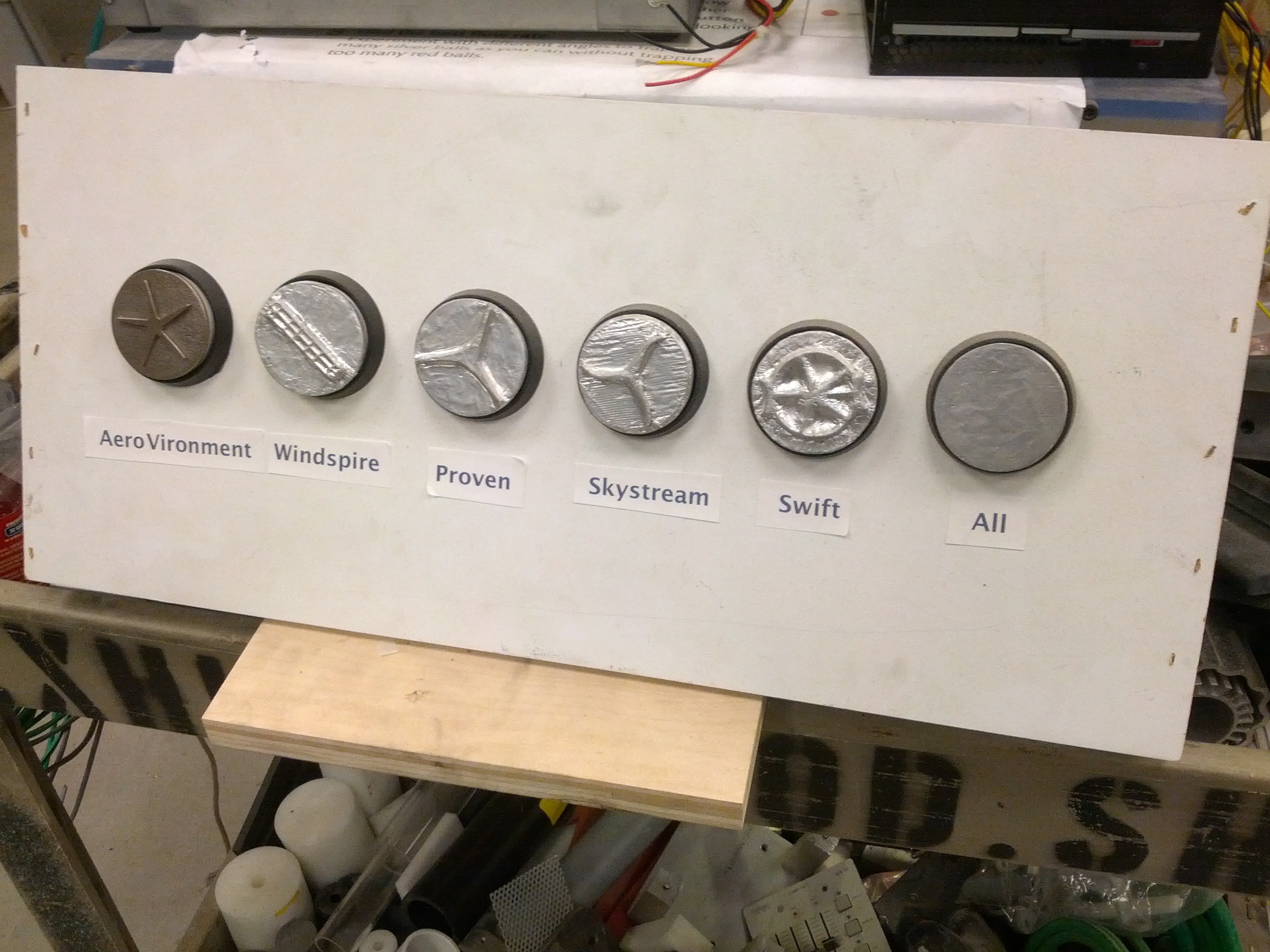 Picture of an array of six capacitive sensing buttons in an early prototype.
The far left button was 3D-printed stainless steel and the other five buttons were 3D-printed in plastic and wrapped with aluminum foil to make them conductive.
Why we tried it
The team wanted a physical representation of the turbines, and by combining the 3D prints of the turbines with a buttons press, served to identify each button directly. By touching the metal button, it triggered an audio label that read the name of the turbine. Physically pressing the button selected the graph our visitors wanted to explore.
How it was made
The buttons were printed in stainless steel because it was the most affordable conductive material; however, bronze and brass were also available. The 3D buttons were designed to fit into an off-the-shelf arcade button. These buttons were altered by removing the small light bulb inside, and replacing it with a piece of metal in the socket.
A spring made the electrical connection between the moving portion of the button and the light bulb socket. A wire ran from the light bulb socket to an Arduino to do the capacitive sensing. Using the Arduino Leonardo to send keystrokes to the computer (one keystroke for the audio when a capacitive sensor detected a touch, and another when the button was pressed).
When someone touched the button there would be a spike in capacitance. Initially, this just sent a threshold for the capacitance values to detect a touch, but a better method created a moving average of all of the capacitive sensors. If the value detected was above the average by a certain amount, then it was a touch event.
 Picture of the deconstructed and altered button with a small piece of metal in the light bulb socket
Why didn’t it work?
We moved away from capacitive sensing buttons because it caused confusion as to how to interact with this component. When visitors touched the button, they triggered audio label readout and expected something more to happen. They did not realize they needed to press the button down to select the turbine graph.
We did not simply eliminate the capacitive functionality of the 3D buttons. The 2-inch round buttons were also too small to allow for to-scale models of the turbines, preventing an accurate understanding of the size differences between each turbine.
What was kept
In the final proof-of-concept exhibit component, we kept the off-the-shelf arcade buttons to be used as regular buttons and 3D-printed models of the turbines were installed below each button. We added a grooved edge for easy navigation between the button and the 3D print, so our visitors can easily associate each button with its 3D-printed turbine.
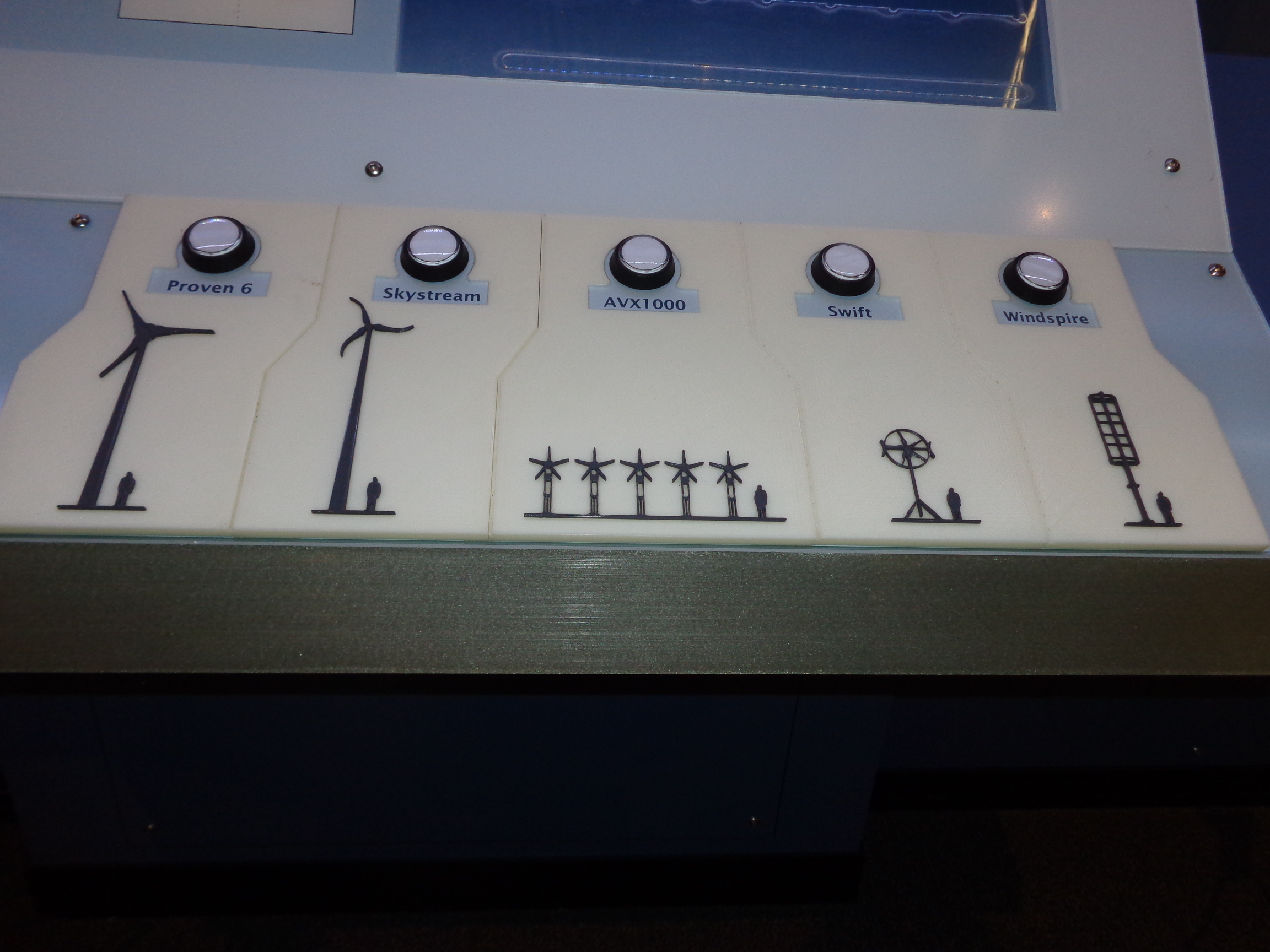 Picture of the final array of five buttons, each with a to-scale, high contrast, 3D-printed turbine below.
Touch Screen Grid Overlay
A clear acrylic die-cut grid, lined up perfectly with the graph grid lines on the touch screen behind.
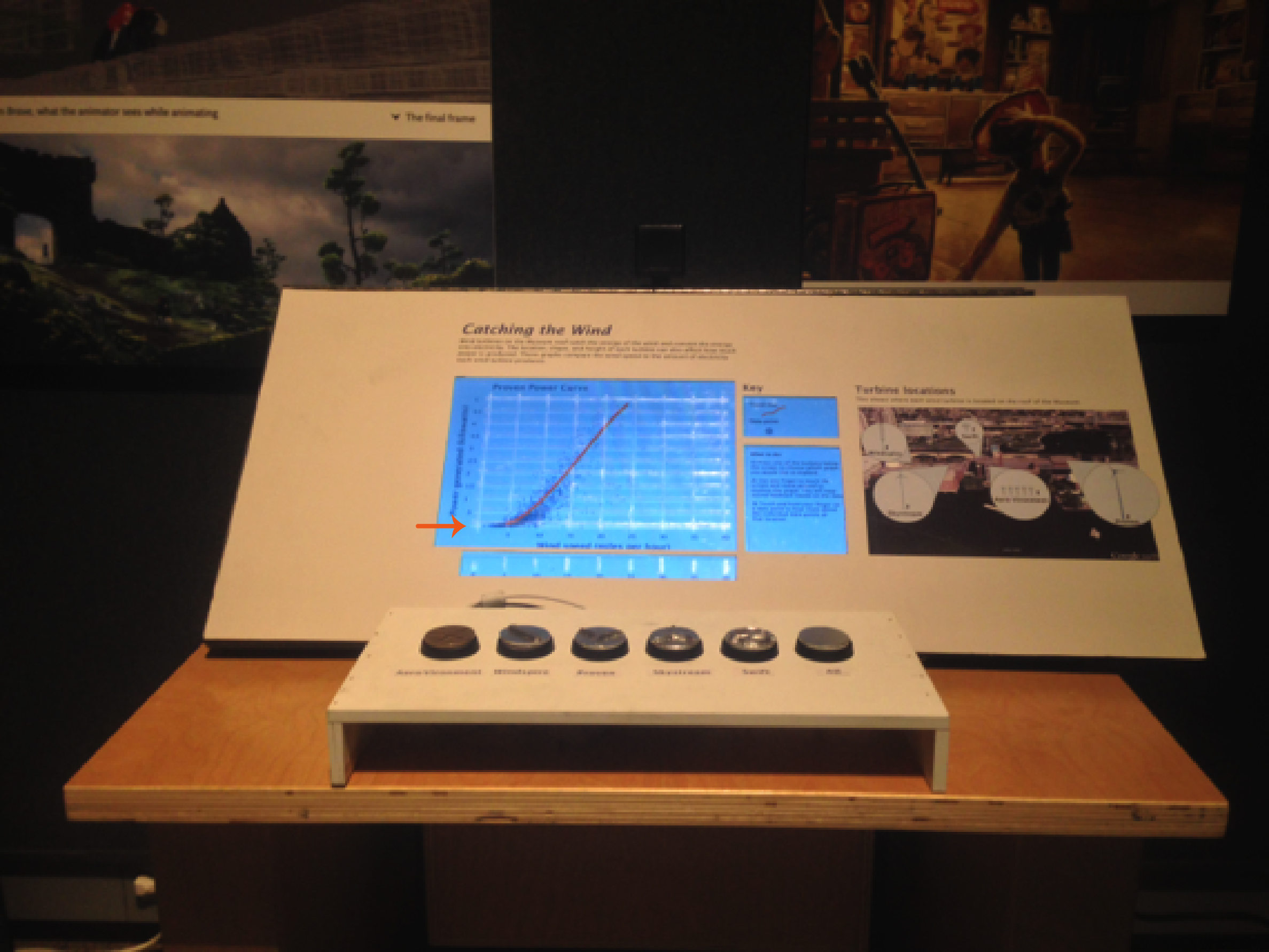 Picture of an early prototype of the exhibit component with an arrow pointing at the touch screen where the clear acrylic grid was attached.
The team discussed the need for a grid overlay that would allow our visitors who are blind or have low vision to be able to identify the lines of the graph for a better sense of where each data point is located. We wanted it to be a clear acrylic overlay so that it would not detract from visual elements of the graph.
How it was made
A graphic was created to the same scale as the graphic for the touch screen graph. It was then cut out in-house using a vinyl cutter. The overlay was attached to a full sheet of clear acrylic with a clear-drying adhesive. The layered acrylic sheets were tested to make sure the underlying touch screen could still sense touch. This solution was not implemented in the final exhibit component, so it was never produced in a more durable way.
Why didn’t it work?
This solution did not work because it ended up being more of a distraction to our visitors than an aid to understand the graph more thoroughly. At the time of this testing, the team was designing the interaction to also allow for a bar graph to compare all of the turbines, but the static overlay caused confusion when the scatterplot graph changed to a bar graph. With further testing, the team discovered that there was a simple solution that didn’t cause as much permanent visual or tactile clutter; audio was added to articulate where on the graph a visitor was touching.
What was kept
A simplified version of the clear acrylic overlay was kept for the final component, in which just the graph axes are raised, with notches along each axis where the grid lines are located. Audio supplements this interaction by articulating the axes titles and gridline increments when they are touched. When a visitor holds their finger in one place on the graph, audio also reads out their location and details about the nearby data.
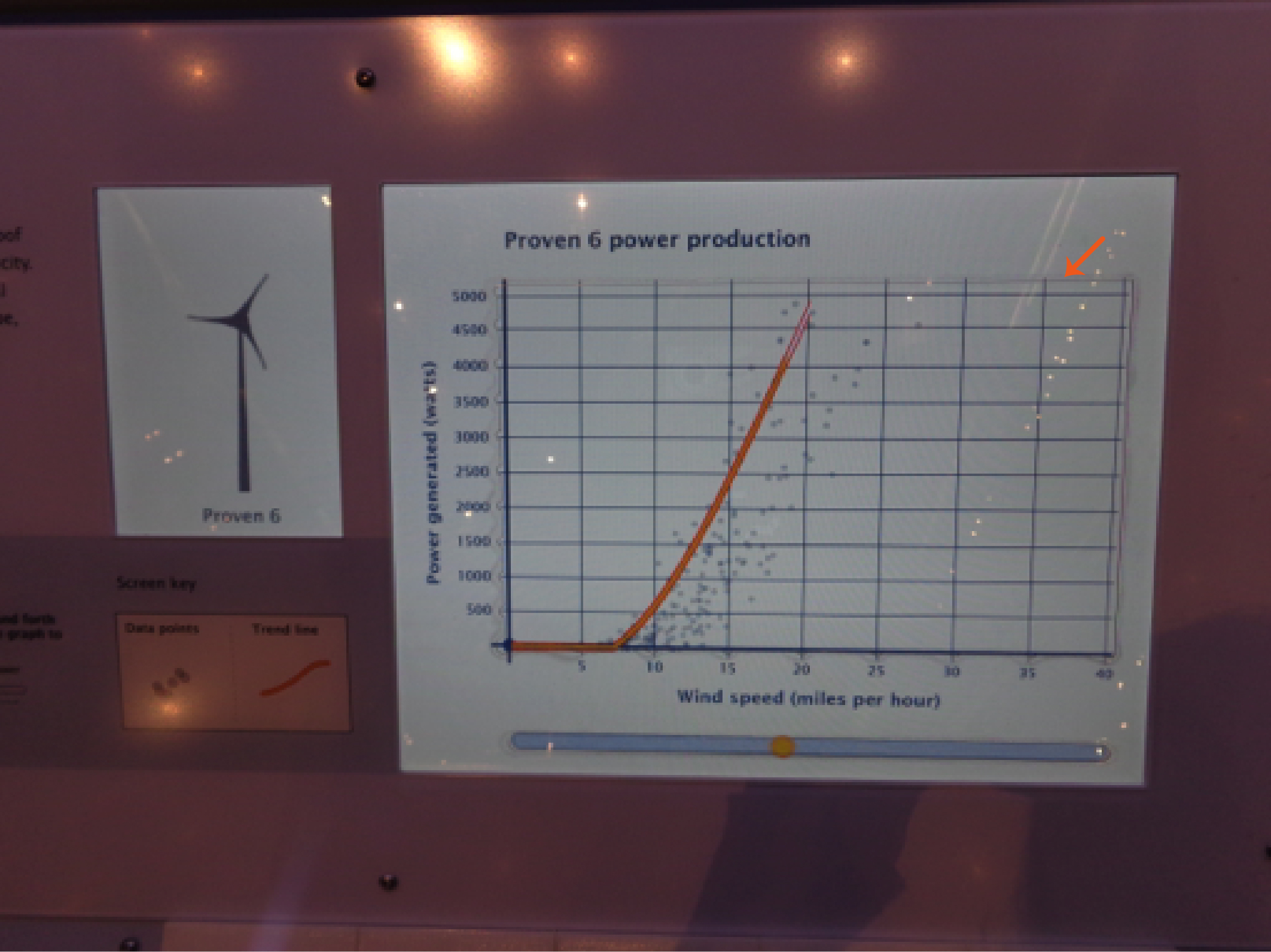 Picture of the graph screen in the final exhibit component with an arrow pointing at the top right corner of the graph where the edge of the clear acrylic overlay is faintly visible.
Sonification Strip
What is this?
A separate horizontal bar below the graph that allowed visitors to run their finger across it to hear the trend line of each graph.
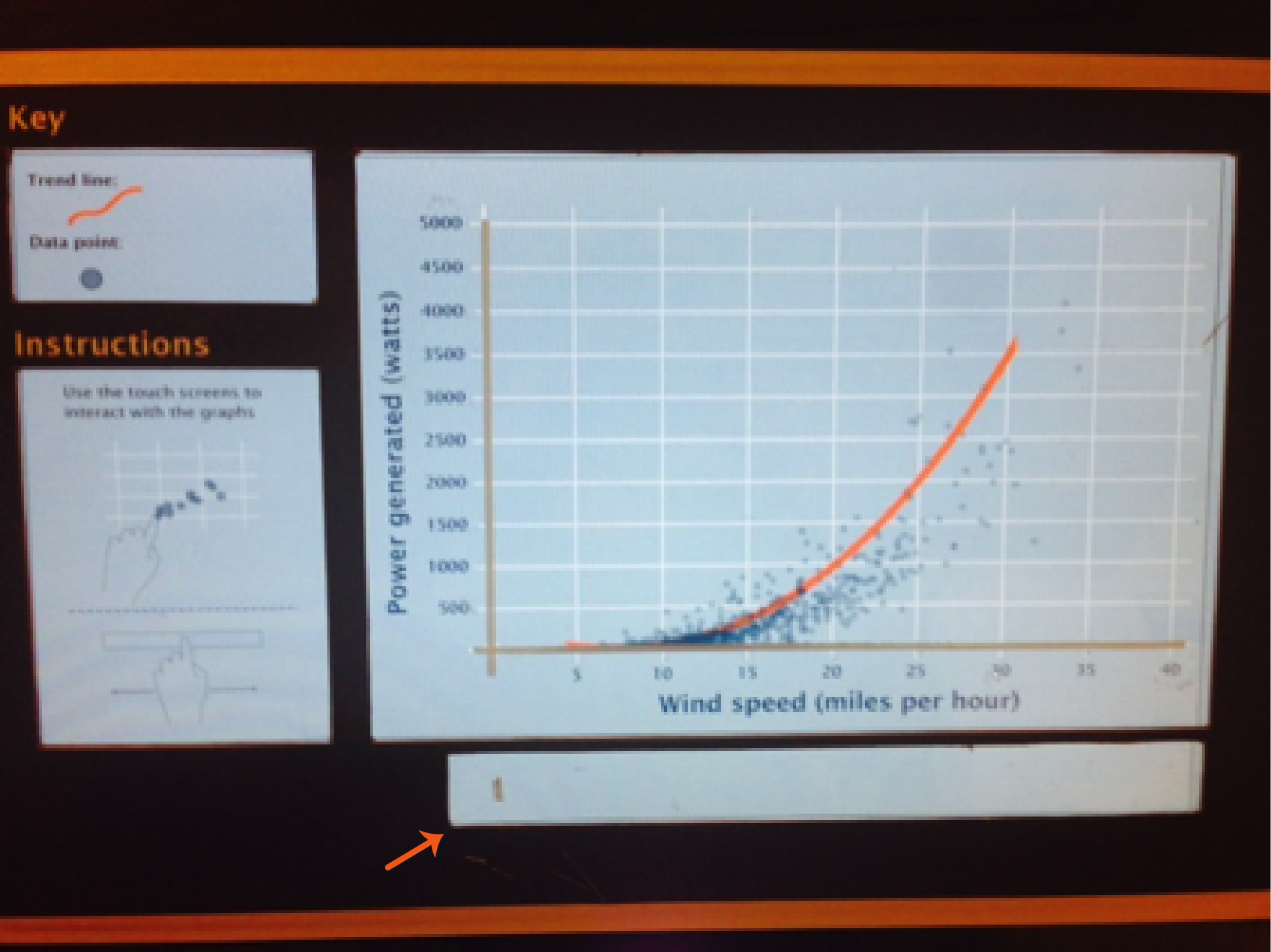 Picture of an early prototype in which the sonification strip and the main graph area were demarcated by two separate cutouts in the graphic that covered the touch screen. An arrow is pointing to the sonification strip.
Why we tried it
We wanted our visitors to hear the trend line quickly and easily, as many times as they would like for each turbine. Hearing the trend line play one time after the button press, and then exploring the data points, didn’t allow all of our visitors to fully understand the power production trend of each turbine. The detached strip would keep the difference in functionality separate from the scatterplot graph above, but still allow for visitors to hear the trend as often as they desired.
How it was made
There was a cutout portion of the graphic that was laid on top of the touch screen. The cutout was a 1-inch tall strip that ran along the full length of the graph, about 1/4 inch below the bottom of the graph.
Why didn’t it work?
The separation between the graph and the sonification strip kept our visitors from either finding it or understanding that it correlated to the trend line on the graph.
What was kept
The team decided to keep the basic concept of the sonification strip, because the ability to hear the trend line multiple times was successful, but integrated it into the tactile acrylic overlay. This allowed for the relationship of the strip and the graph to be more integrated.
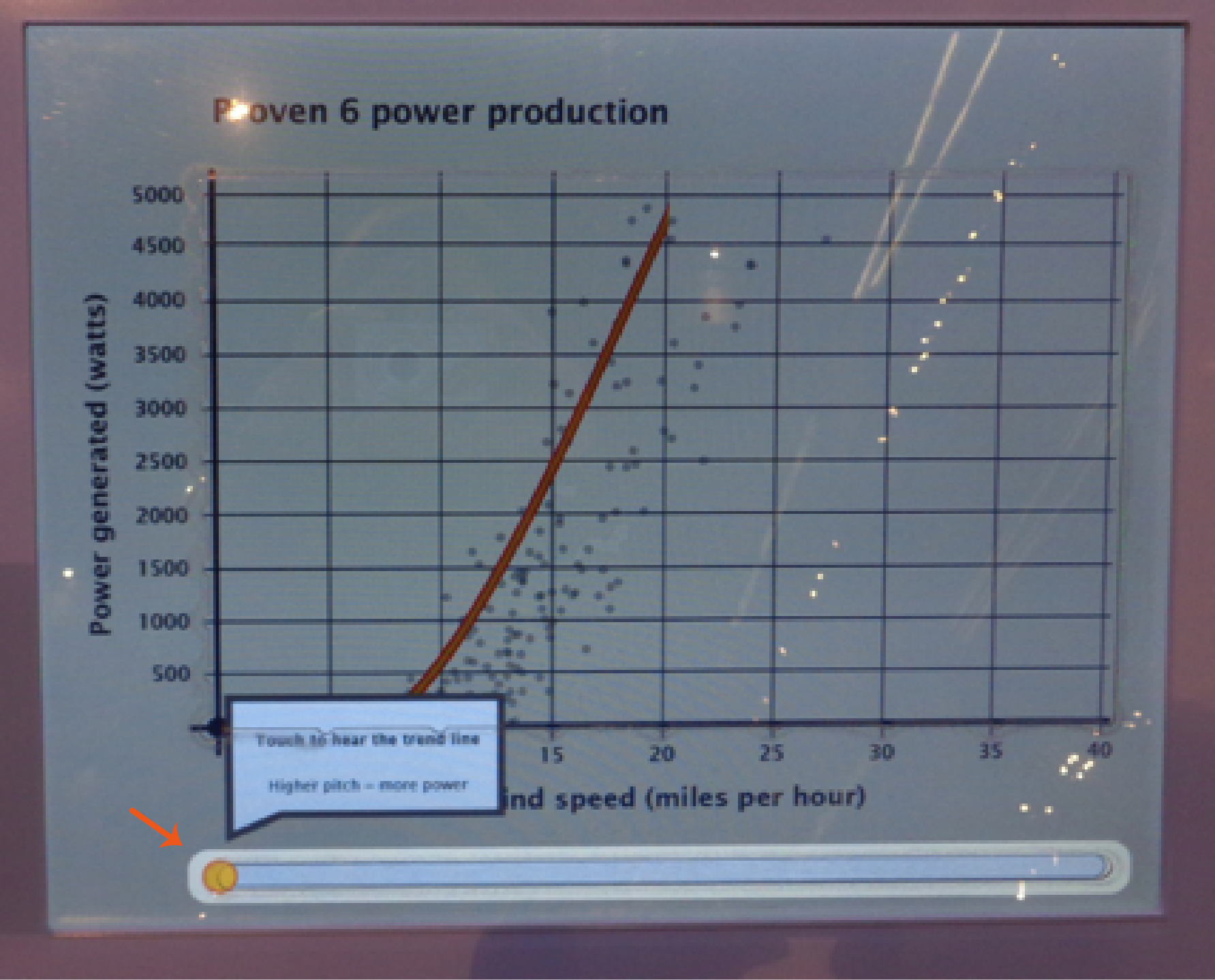 Picture of the final exhibit component touch screen with the sonification strip highlighted during the introduction to the graph. There is an arrow pointing to the sonification strip and the text on the screen states: Touch to hear the trend line; Higher pitch = more power.
These three examples of unused tactile concepts led to a stronger final design for our component, but they may be more applicable in different situations. Have you tried other tactile options for visitors? Leave a comment below with other resources that have worked for you.
CMME Exhibit Component: Formative Evaluation Summary
Formative Evaluation Methods:
A total of nine iterations of the Creating Museum Media for Everyone (CMME) exhibit prototype were tested throughout the formative evaluation phase, which occurred from April 2013 to March 2014. Overall, 134 visitors took part in testing the prototypes. This includes 15 recruited people with disabilities and 119 general Museum visitors (who were not asked whether they identified as having a disability). Because people with disabilities were the target audience for this project, they were recruited to come in and test prototypes throughout the exhibit creation process. Their input was crucial for creating a universally designed component. However, even though people with disabilities were the target audience, all Museum of Science exhibits are tested with general Museum visitors to ensure usability, understanding, and interest in exhibits. Testing with people who have a variety of abilities and disabilities ensured that added features that would enhance the accessibility of the exhibit for some visitors did not hinder the experience for others.
The table below outlines the types of disabilities represented in the testing sample:
| Type of Disability |
Number of participants |
| Blind or low vision |
9 |
| Physical |
2 |
| Intellectual |
5 |
| Deaf or hard of hearing |
3 |
Note: Some participants identified as having multiple disabilities. Therefore, totals do not add up to 15.
For each testing session, all visitors were asked to use the component as they normally would if they had walked up to it in the Museum. While they were exploring the interactive, visitors were also asked to use a “think-aloud protocol,” describing what they were thinking about during each step of the interaction. After they were done exploring, the evaluator asked some interview questions and sometimes prompted the visitors to use features that they hadn’t explored on their own. The testing protocol used with on-the-floor Museum visitors versus recruited visitors with disabilities was largely the same, except that the following question was added when testing with recruited visitors with disabilities: “Was there anything you wanted to do when using this exhibit that you were not able to?”
Impacts of formative evaluation on the final design:
Specific parts of the component, its features, and the exhibit content are referenced throughout this post and are explained in depth in the CMME Final Exhibit Component blog post. Briefly, the component presents data about the power generated by five wind turbines on the Museum of Science roof in the form of line and scatterplot graphs. Summarized below are main findings from the formative evaluation, which include a description of visitors’ experiences during testing and how these experiences impacted the final design of the exhibit component.
1. Understanding when there were no data points in an area of the graph
What happened during testing?
When testing the first sonification prototype with three people who are blind, all three people oriented themselves to the component by feeling it with both hands. The screen often froze when multiple fingers touched the screen at once, making it unclear to the visitors whether the prototype was broken or not.
How is this addressed in the final component?
A sound clip of static is now played whenever a visitor is touching an area of the screen that does not have data.
2. Dealing with multi-touch screen capabilities
What happened during testing?
When testing the first sonification prototype with three people who are blind, all three people oriented themselves to the component by feeling it with both hands. The screen often froze when multiple fingers touched the screen at once, making it unclear to the visitors whether the prototype was broken or not.
How is this addressed in the final component?
1) All audio that describes using the touch screen tells visitors to “use one finger” when using the touch screen. 2) The multi-touch option for the screen is now programmed such that if multiple fingers are on the screen at once, it reads data from an average of those points.
3. Accessing the information found on the graph axes
What happened during testing?
When people who are blind were testing an early version of the prototype, in order to get information about the number of watts or number of miles per hour at any specific data point shown on the screen, they would have to remember how many increments they had passed on the axes. Unless they went back and counted the increments on each axis, they were unable to tell which point they were touching.
How is this addressed in the final component?
1) Axes titles as well as graph values are read aloud when a visitor moves their finger along each axis. 2) When a finger is held down in one place on the graph or along the trend scrub bar, data values from that area are verbalized (i.e. "Average power production: X watts at Y miles per hour").
4. Being introduced to the component features
What happened during testing?
During testing of a close-to-final version of the prototype where visitors could explore all five graphs, an introductory broadcast audio clip played when the first graph button was pushed. This audio clip verbalized information that was included on the exhibit label about what to do at the component. During formative evaluation, this introductory audio could be interrupted if a visitor pushed another button or touched the screen. All visitors who tested in this session interrupted the audio before it finished, often doing so when the audio encouraged them to touch the screen. Many visitors had difficulty knowing what to do and which options were available for exploring the data. The instructions and information given at the end of this audio blurb were areas that many visitors did not use or did not understand during this session.
How is this addressed in the final component?
The introductory audio blurb is now un-interruptible. Visitors must listen to this audio broadcast before being able to interact, something uncharacteristic of exhibit interactives at the Museum of Science. If a visitor touches the screen or pushes a button while the locked audio is broadcasting, a negative sound is given as feedback so visitors know that the exhibit is not broken, but they must wait until they hear “now you can explore on your own” to move on. After implementing this change, visitors understood the instructions and options for exploration more clearly and did not appear to be negatively impacted by the un-interruptible intro audio.
5. Differentiating wind turbines
What happened during testing?
Throughout testing, many visitors were having trouble figuring out what the terms "Aerovironment," "Windspire," "Proven," "Swift," and "Skystream" meant. These were the wind turbine names that labeled each button and graph. Understanding that these terms were names of different wind turbines was essential for visitors to understand the exhibit content.
How is this addressed in the final component?
We first tried labeling the turbines with a letter (i.e. Wind Turbine A: Proven), but visitors who are blind did not prefer this strategy because the word that differentiates the buttons was not the first one they heard. Instead, we decided to change or modify some turbine names so that visitors can better understand that they are brand names. For instance “Aerovironment” was changed to “AVX1000” and “Proven” was changed to “Proven 6.” This solution allowed for the first word to be unique while making the turbine names less confusing.
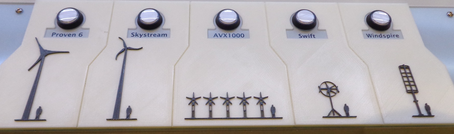 Final wind turbine names used in the exhibit: These names are found under the buttons and above the high contrast tactile images of each wind turbine as well as on screen as graph titles.
6. Connecting each graph to its accompanying wind turbine
What happened during testing?
Visitors had some difficulties throughout the formative evaluation understanding that pushing a new button would change the graph shown on the screen and present data from a different wind turbine. For instance, some visitors were able to interpret the data on the screen but weren’t sure what the difference was between different graphs.
How is this addressed in the final component?
1) Each button that corresponds to a wind turbine lights up when visitors choose that button/graph, and 2) an area of the screen is designated for an animation of the related turbine. When a new button is pushed, an animated image of the turbine whose data is shown on the accompanying graph is shown on this part of the screen.
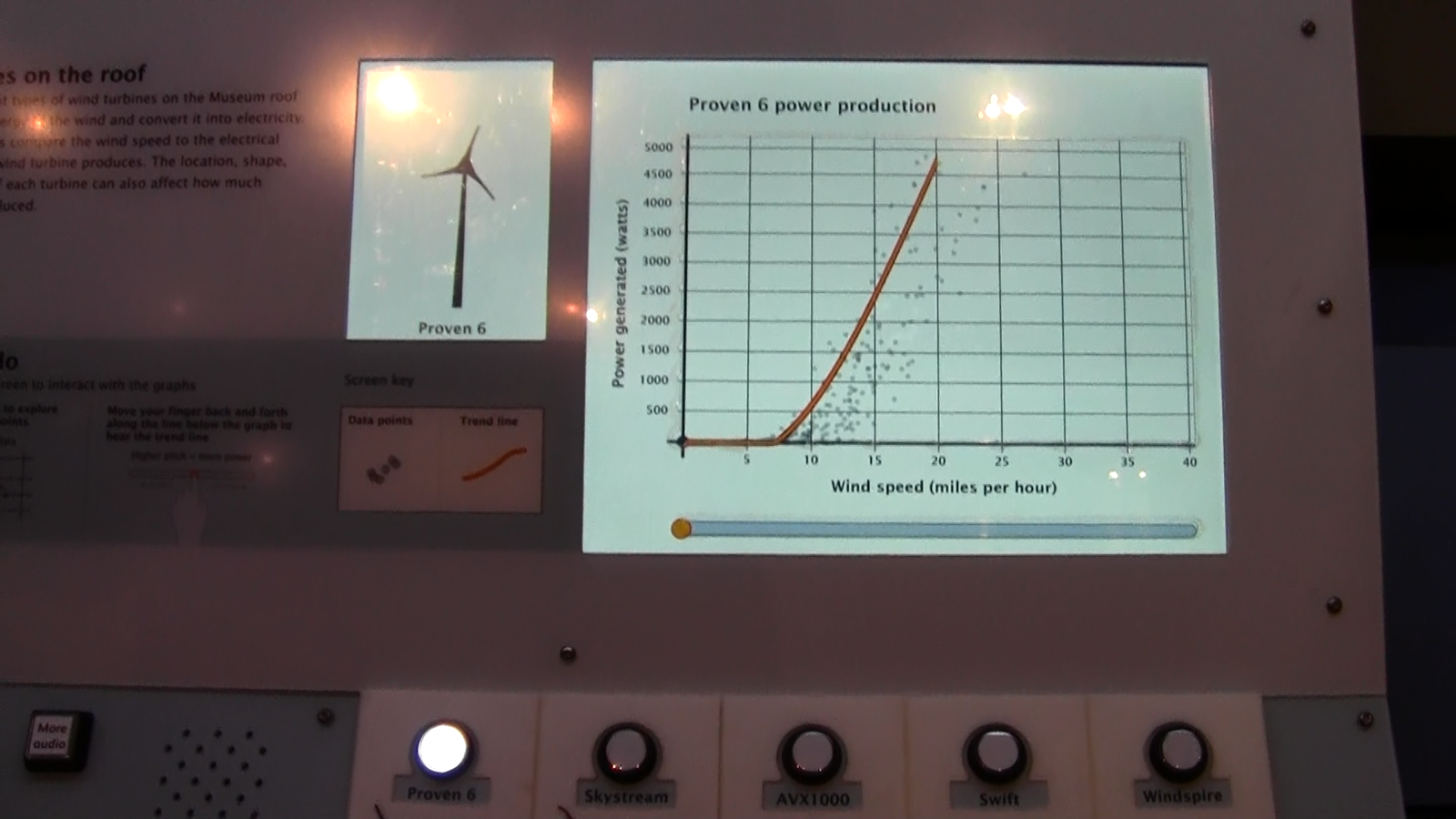 Final exhibit component where the button for Proven 6 is lit up and the screen in the upper left corner shows an animation of Proven 6.
7. Finding the component welcoming
What happened during testing?
A few groups who tested the prototypes throughout the formative evaluation mentioned that they would not be likely to walk up to a screen with graphs on it, either because they didn’t like graphs and didn’t think the activity would be fun, or because they found graphs complex and intimidating. In one of the later testing sessions, one group talked about how much they ended up enjoying the interactive, even though they talked about it initially looking boring and complex when they walked up to it.
How is this addressed in the final component?
A welcome screen was added to the component that shows an animated drawing of the spinning wind turbines mounted on the Museum roof, whose power production data is represented in the graphs. This screen instructs visitors to “press a round button to begin.” If the screen is touched, the instruction “press a round button below the screen to begin” is also read aloud.
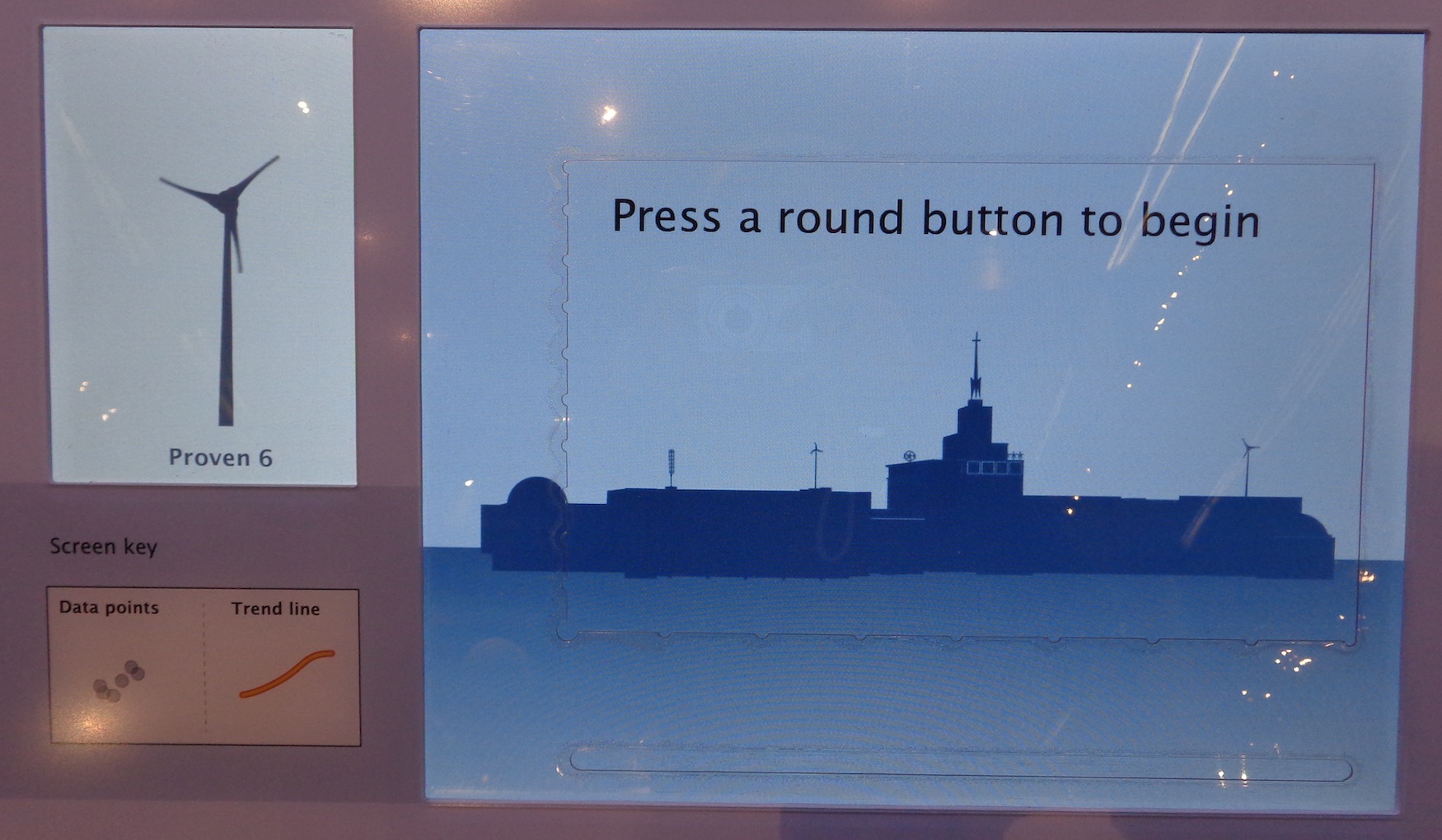 Welcome prompt screen on the final component.